![A logo for "50 Happens," [a site dedicated to Gen X women with children and grandchildren] [who embrace life's challenges with humor and resilience], [featuring a modern and uplifting design] [that embodies strength and positivity] [with an elegant and playful style] [and a harmonious blend of colors like pink, fuchsia, purple, and blue].](https://50happens.blog/wp-content/uploads/2024/12/img-5uorrxvwartomopcpuhjfjd0.png?w=300)
I decided to try painting something to submit to an “Art for Democracy” contest being run by my church. It’s open to professional artists throughout New England and there are cash prizes, so I’m not getting my hopes up. I’m thinking of it as an “artistic prompt” (like the daily writing prompt here on WordPress).
Here’s the actual prompt:
Art is a powerful tool for social change. Unbound by age, culture or social location, it sparks the imagination and promotes meaningful dialogue. With the goal of encouraging civic engagement, artists across New England are invited to submit works on the theme of protecting and strengthening American democracy. Artworks should express the goals of promoting unity and the common good, which underscores the American ideals that all voices are important and that our strength lies in welcoming diverse perspectives. Our goal is to spur productive dialogue; showcase the work of New England artists; and celebrate democracy.
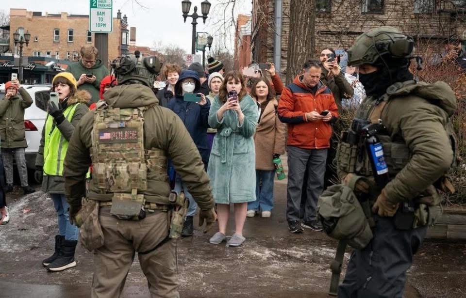
Like many people, I was inspired by the people of Minneapolis who bravely stood up to ICE in the frigid cold to try to protect their community, even after Nicole Good and Alex Pretti were assassinated. There was one viral photo by an unidentified photographer that really struck me. A woman went outside in her bathrobe and slippers to join a crowd of others documenting ICE actions in their neighborhood:
So I decided to paint that.
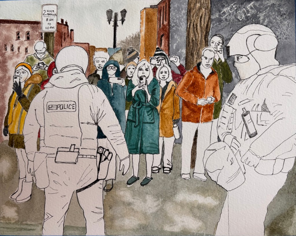
So here’s the dilemma: Should I perhaps leave the two Police/ICE agents as unpainted line drawings? Do you think it might be effective like that? From my perspective, they are unwanted invaders in this community. Maybe the contrast with the good people of Minneapolis would be greater if I leave them unpainted. Ghosts in the Machine, so to speak. OR should I paint them monochromatic in shades of grey? What do you think? Which would make a better painting?

Oh wow, that’s a powerful choice. Maybe you should paint the agents in black & white because their existence is like going back in time before media was in colour. Just a thought.
LikeLiked by 1 person
Oh, good thought! They are like a throwback to a previous, less enlightened, black and white era. Thanks for the input Pooja!
LikeLiked by 1 person
Yes exactly! You’re so welcome.
LikeLiked by 1 person
I say unpainted, whatever makes them look as ugly and unwanted as possible lol
LikeLiked by 1 person
Thanks CJ! Yeah, that’s definitely what I’m going for. Your input is appreciated 🙏🏼
LikeLiked by 1 person
What a great challenge. I like the idea of the agents being unpainted – makes them less than human. Powerful artwork either way, my friend.
LikeLiked by 1 person
Thanks so much for your input and support May! 🙏🏼
LikeLike
Oh, excellent! Yes, leave them unpainted. So striking that way. Best of luck!
LikeLiked by 1 person
Thanks for weighing in Laurie! I appreciate it 🙏🏼
LikeLiked by 1 person
I’m by no means an artist. I need to say that upfront, but I actually looked at your painting first and thought it was complete. I love the idea of the police/ICe agents and the faces unpainted. It feels more participatory. As viewers we have to decide how we’re going to respond. Will we be like the ice agents in life or will we speak up and care for our neighbor? Maybe it’s just me but the unfinished agents definitely jump out more! Looks amazing, a beautiful painting.
LikeLiked by 1 person
Wow! Thanks for your comment Brian. I really appreciate the input! Interesting idea to leave the crowd faces unpainted too. 🤔
LikeLiked by 1 person
Whoa… Mary. I am impressed. It must be difficult trying to control smaller details with watercolors. So far it looks amazing. And yeah, the women out in her robe and slippers protesting. That was pretty powerful to see that photo.
LikeLiked by 1 person
Thank you so much for your feedback! It is a lot of details to try and include.
LikeLiked by 1 person
I like the effect, purely artistically, of leaving some unpainted, because I was about to remark that the work-in-progress-ness of it is striking and you could almost just stop right here. Very impressive, Mary, and good idea!
LikeLiked by 1 person
Thanks so much for your input and support Stephanie! Much appreciated. I’m leaning towards leaving the police unpainted.
LikeLiked by 1 person
I’d go for the gray. There’s something too benign ( to me) in leaving them unpainted.
More power to you, MaryG!
LikeLiked by 1 person
Thanks so much for weighing in Annie. I appreciate it!
LikeLiked by 1 person
My vote is for unpainted. It looks awesome, by the way.
LikeLiked by 1 person
Thanks so much for your input and support Edward. Much appreciated!! 🙏🏼
LikeLiked by 1 person
You’re very welcome, Mary. Hopefully, you’ll tell us which way you decided to go and show us the finished product. Either way, it’s going to be wonderful.
LikeLiked by 1 person
Will do, Edward! Submissions aren’t due til April 10, so I’m still thinking it over. 🤔
Thanks again for your kind support.
LikeLiked by 1 person
This is really good, and I think you should get your hopes up.
My $.02: in my mind, ICE should be in color and the citizens should be grayed out, because that’s how it’s feeling, but I do understand your point here. The citizens, in some way, actually “won.”
To answer your question, I think monochromatic to really show a clear contrast between the citizens and ICE.
LikeLiked by 1 person
Thanks so much for your support and input Kathy! And good point…I’m a bit worried that leaving the ice guys white might seem like I’m ambiguous about them. 🤔 Will post final version.
Thanks again!!
LikeLiked by 1 person
You’re welcome! I’m looking forward to seeing the final.
LikeLiked by 1 person