![A logo for "50 Happens," [a site dedicated to Gen X women with children and grandchildren] [who embrace life's challenges with humor and resilience], [featuring a modern and uplifting design] [that embodies strength and positivity] [with an elegant and playful style] [and a harmonious blend of colors like pink, fuchsia, purple, and blue].](https://50happens.blog/wp-content/uploads/2024/12/img-5uorrxvwartomopcpuhjfjd0.png?w=300)

Are you a lifelong learner?
Yes, but I “study” what I want. I got my BA in History and never went back for a graduate degree because they all sounded so boring and cost too much money. MBA? (snooze fest) Law School? (are you joking?) A Master’s in History? (not interested)
And when I was working, I was never big on “professional development.” I only took the required stuff on topics like cybersecurity. All those LinkedIn courses and certifications on business-y topics were available to me, but I hardly ever opted in. I felt like the best way to get better at my job was to do it, and since I was a fundraiser, the proof was in the pudding. I raised millions of dollars for my employers and clients. Nobody cared that I didn’t have an MBA.
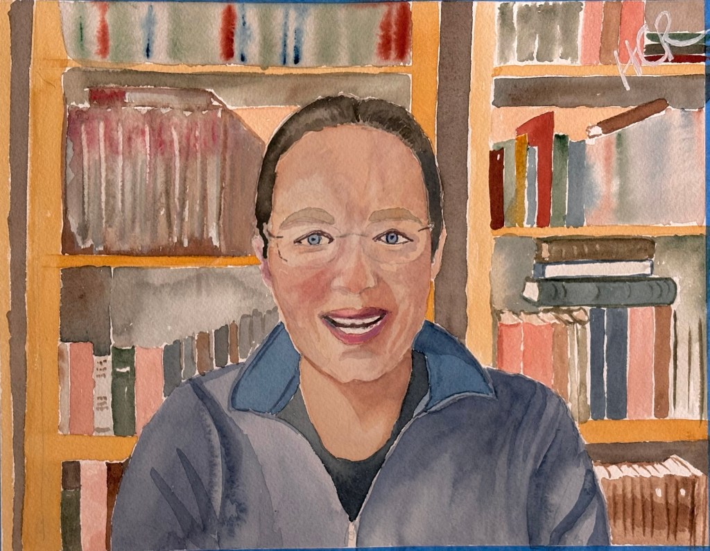
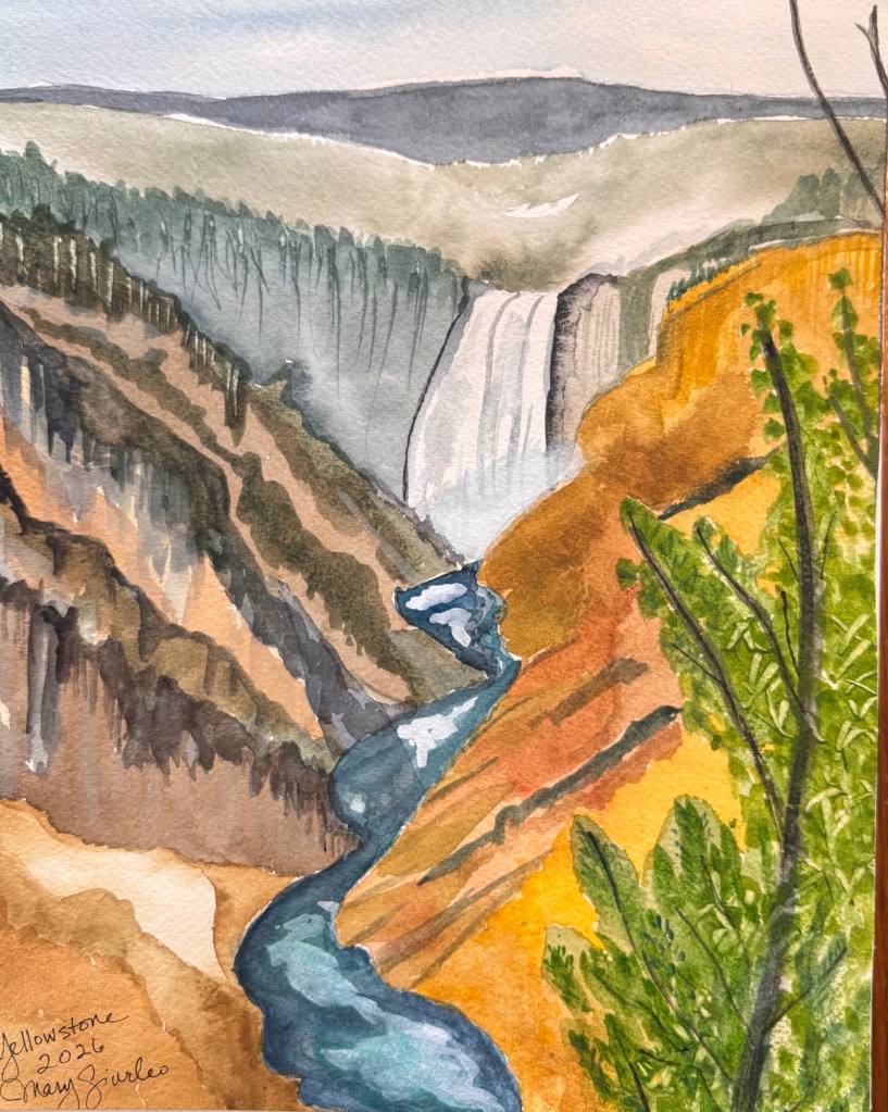
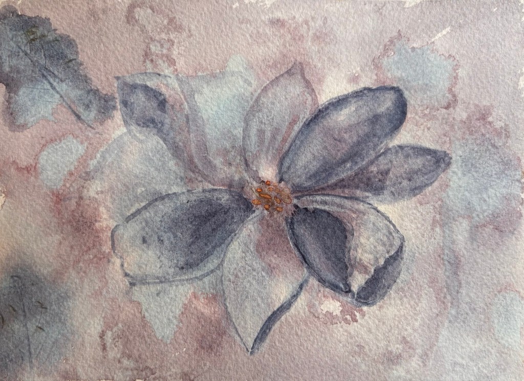
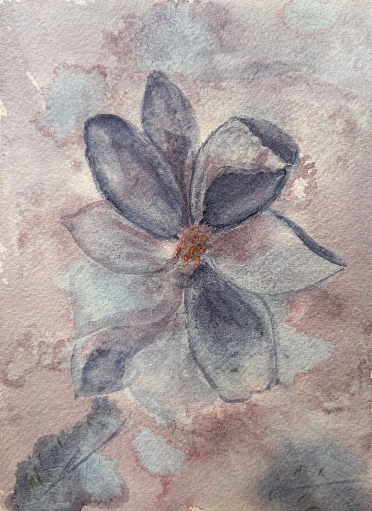
Courses I took outside of work included Italian, photography and music (singing lessons). Now that I’m retired, it’s been studio art classes that interest me most, particularly watercolors.
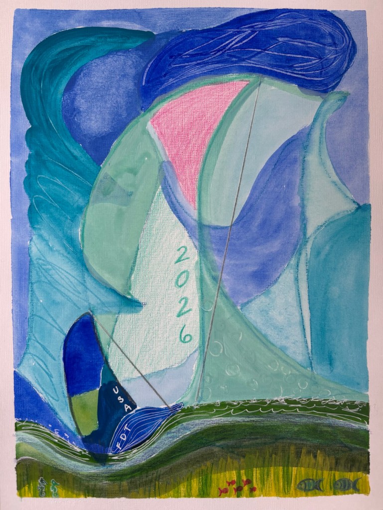
In fact, just yesterday I participated in a 2.5 hour class called “Yoga, Meditation and Abstract Art.” It was my first time using acrylic paint in decades. My abstract piece really wanted to become some sailboats on a green sea, so that’s what happened.