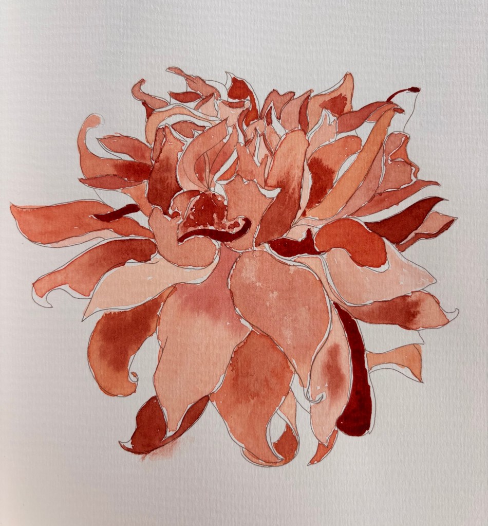
Blizzard painting

We’re in a blizzard here in Massachusetts. Fortunately the power is still on, but we ain’t going anywhere for a looooong time.

Settling in.

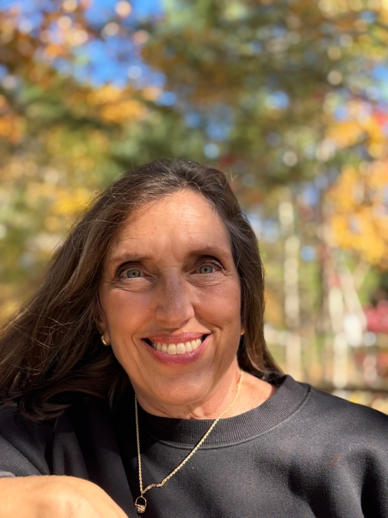
I decided to try painting another portrait (my own) based on a photograph.

Here’s the inspo pic from last fall:
Here my painting:
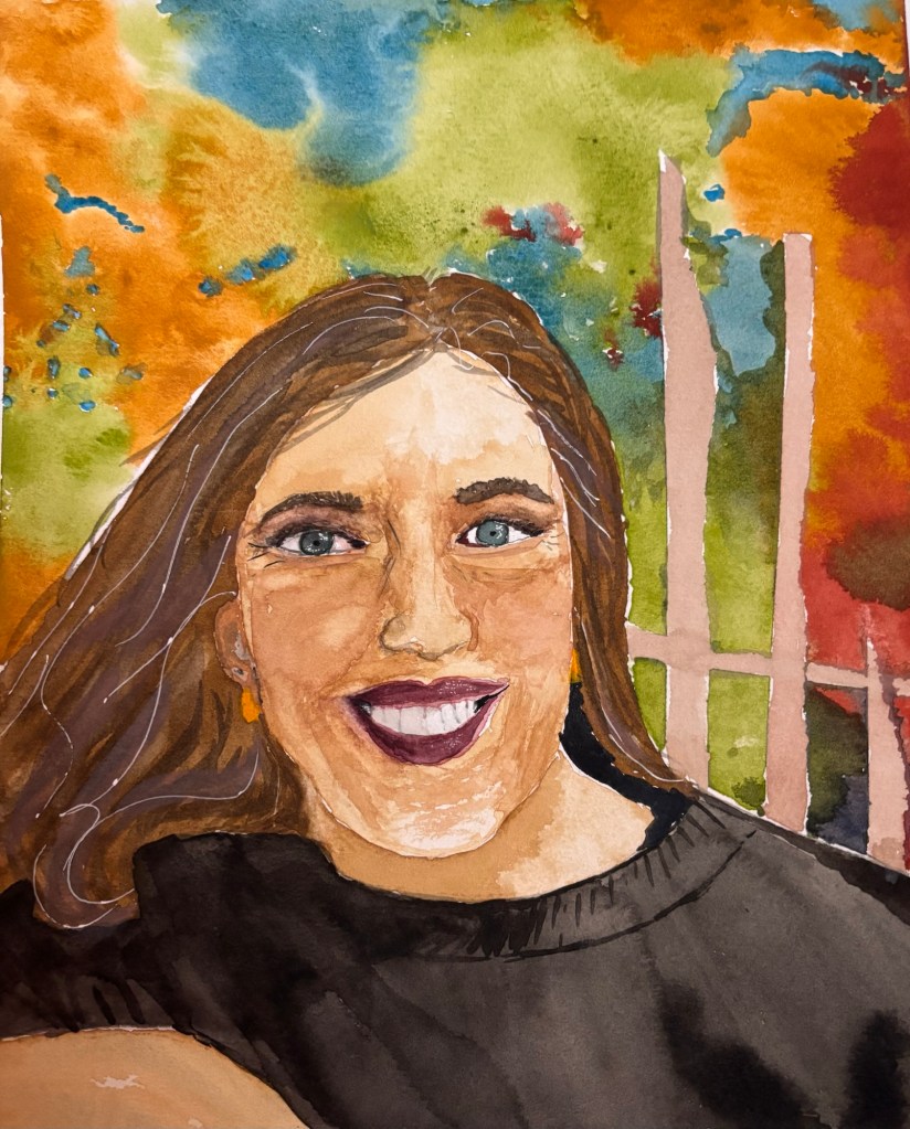
Portraits are hard! This makes me want to take another class with my teacher from last fall. She was good at portraits, but alas, I have registered for a different (cheaper) class, closer to home, where we will focus on “cute baby farm animals.”

ChatGPT gave me some solid feedback on the portrait though:

Lightly mapping planes (forehead plane, side planes of nose, cheek planes) before committing to color would increase dimensional accuracy.

The biggest difference between the painting and photo is contrast and value structure.

The photo has stronger: Shadow under the brow ridge Shadow on the right side of the face (viewer’s right) Cast shadow under the nose Subtle shadow under the lower lip

In the painting:

Midtones dominate. Shadows aren’t quite dark enough, especially around the eyes and under the cheekbones. This reduces form and depth.

Fix: Push darks 15–20% deeper in:

Eye sockets Side of nose Under cheekbone (viewer’s right side) Neck shadow under chin

That alone would dramatically increase realism.

Biggest Growth Area:

Value structure and form modeling

If you deepen shadows and increase plane awareness, this would jump from a good portrait to a very strong one.

OK, I can take that criticism (nicer than some human art teachers I’ve known) and I agree with it.

Related post:
ChatGPT as Art Teacher

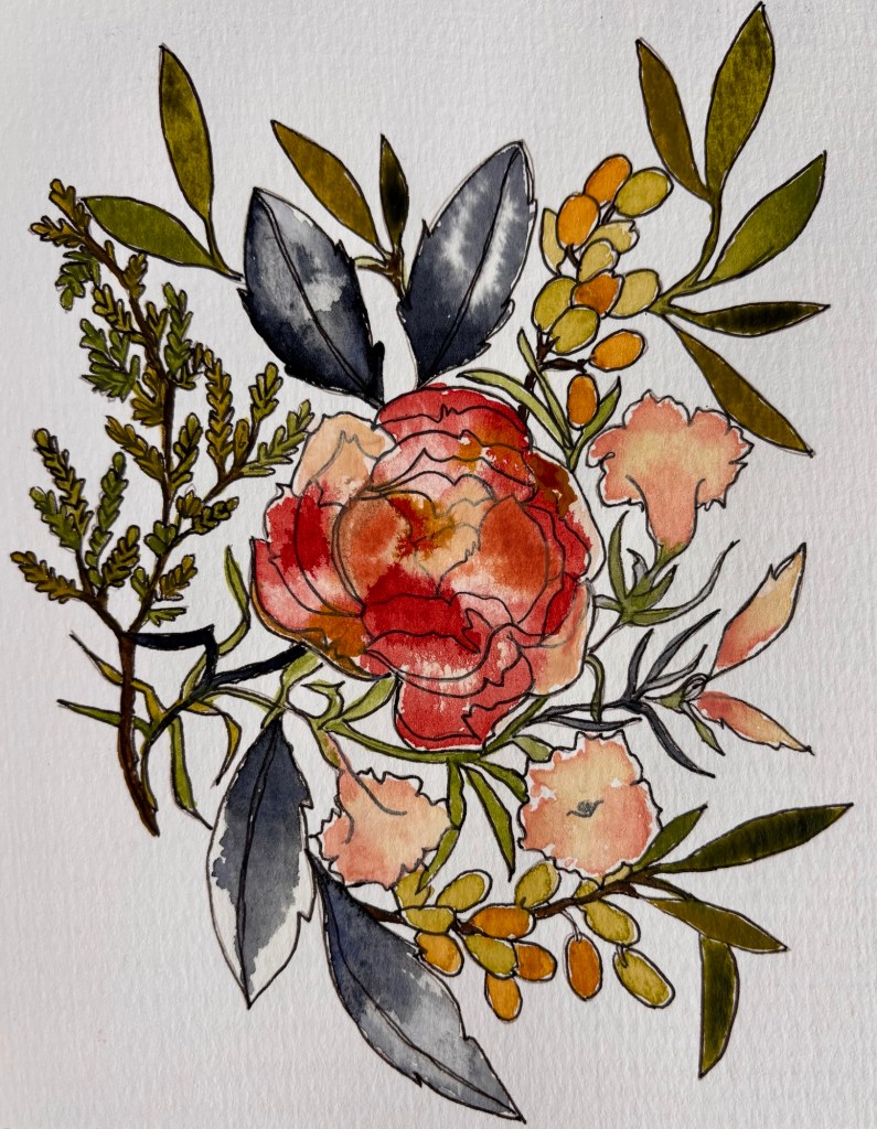
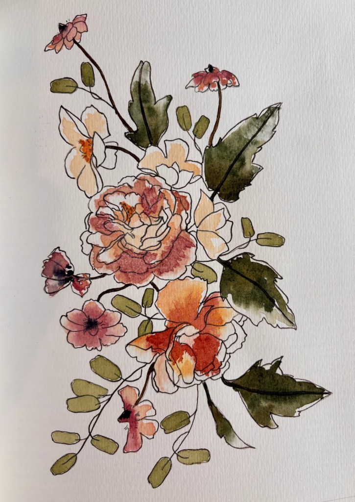
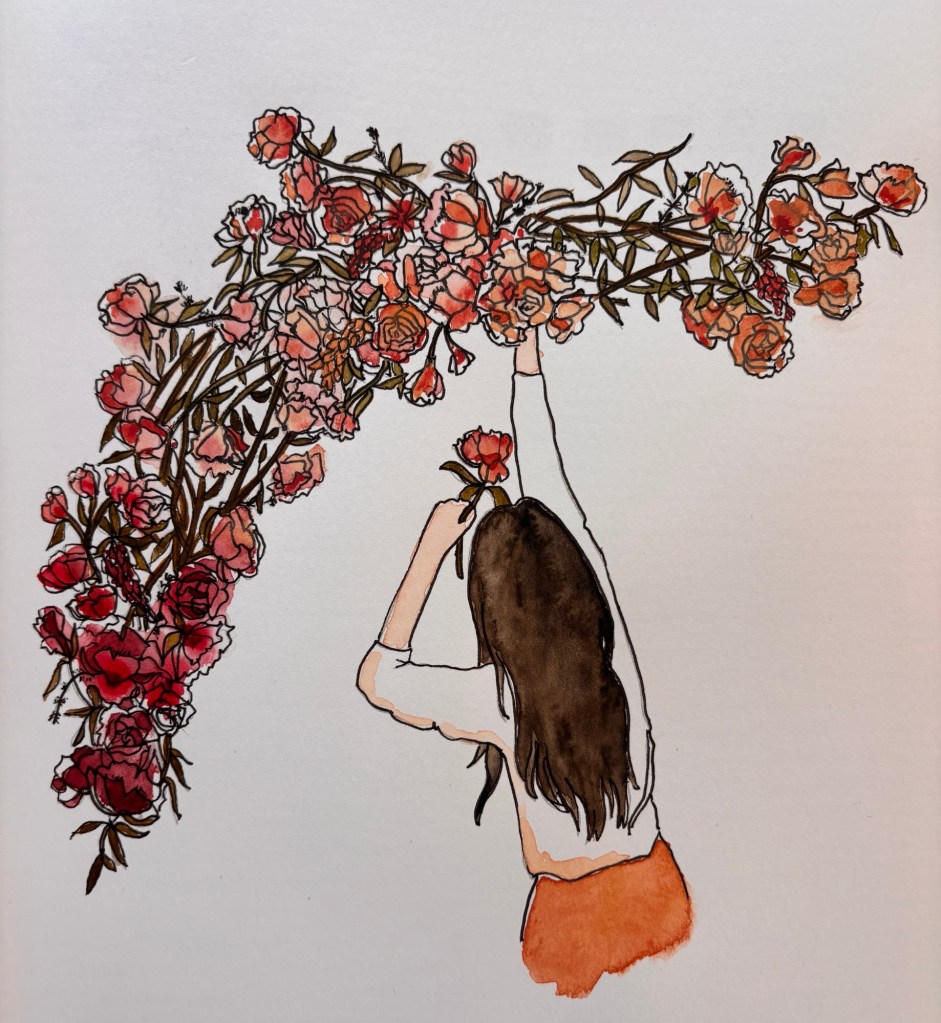
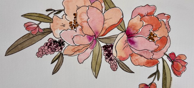
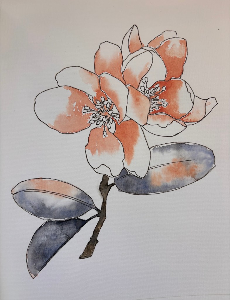
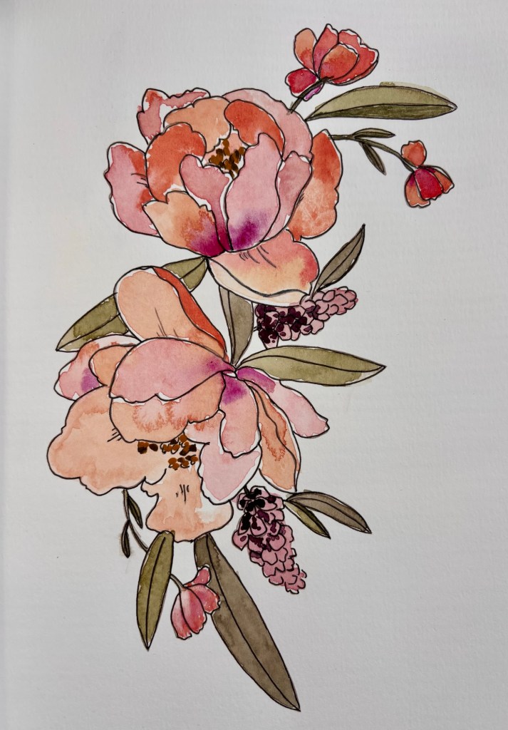
Watercolors—botanicals 10

These are the last few pages in my botanicals “Watercolor Workbook” by Sarah Simon, a very thoughtful Christmas gift from my daughter.

It was great because it kept me painting through January and February in this very cold and snowy Winter of the Knee, where we’ve mostly just stayed home. (Part 2 of The Year of the Knee—aka “The Other Knee”—is now scheduled for March 16. 🙄)

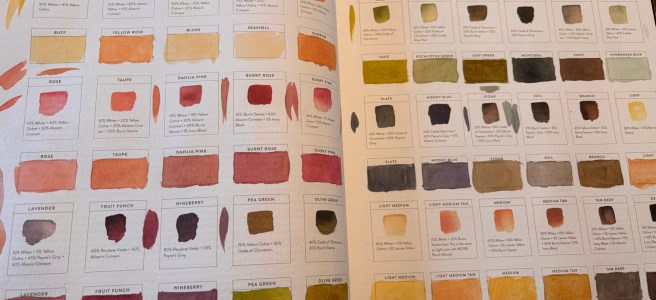
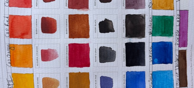
I enjoyed inking the pre-printed designs with my new artists pens and learned a few good techniques for painting flowers and foliage. Also, I got a lot of useful color mixing information. Each page preserves my color recipes, which will be convenient for future reference.

Finally, hurray for flowers and plants! I’m bad at growing them, but they’re fun to draw, paint. and photograph.

🌺🌿🌷🌻🌼🪴🌱🌸

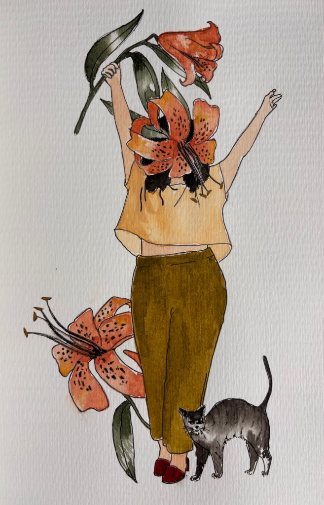
“Lady Lily” and her little cat 🐈‍⬛
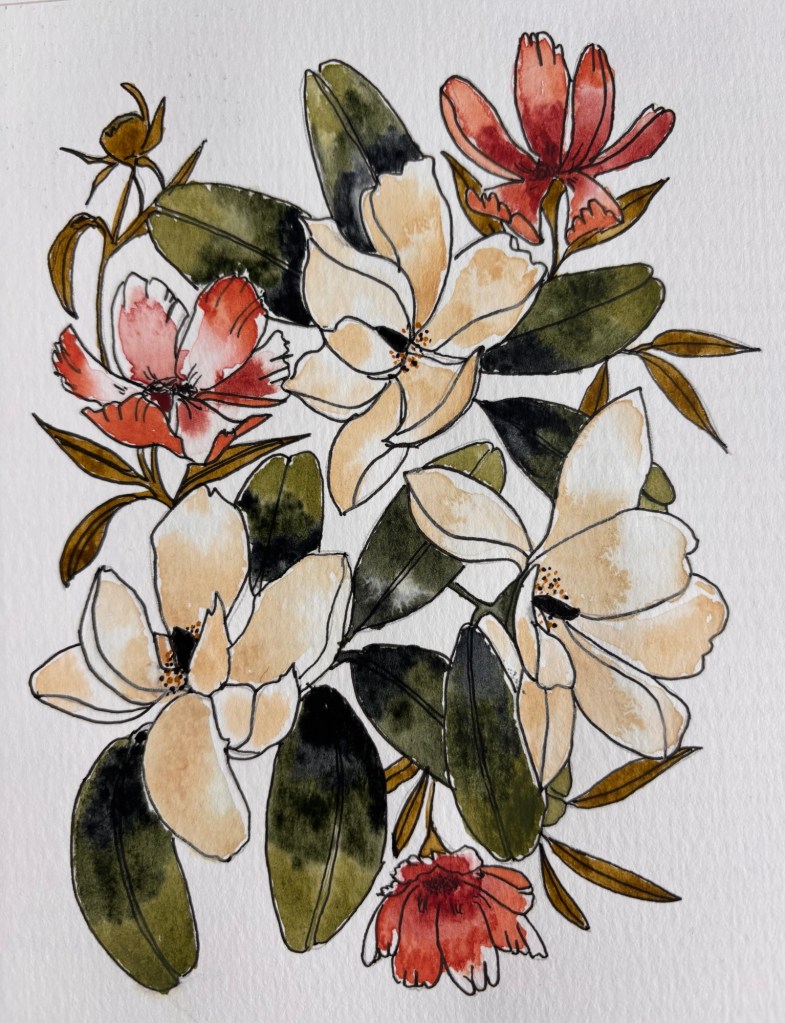
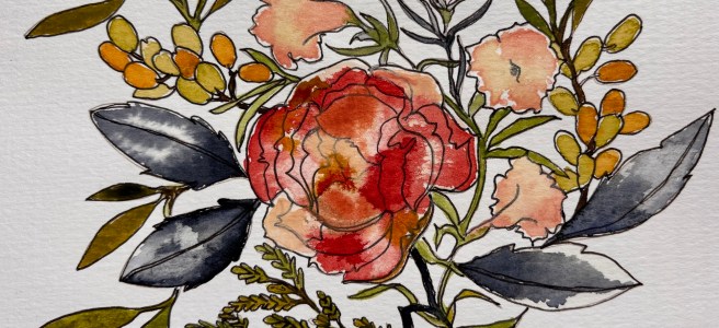
Cosmos and Magnolias
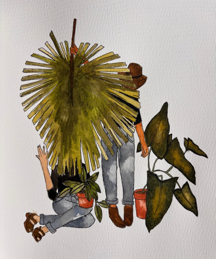
This design is called “Plant Lady Besties” 😊
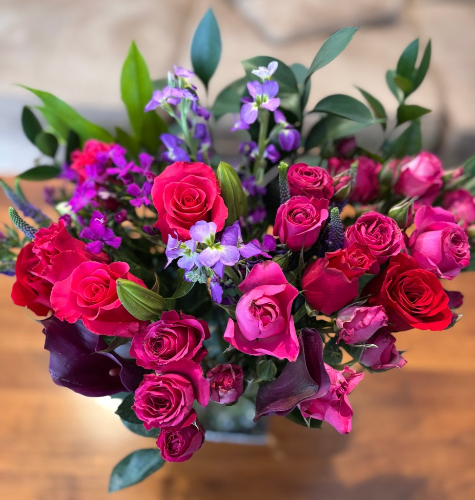
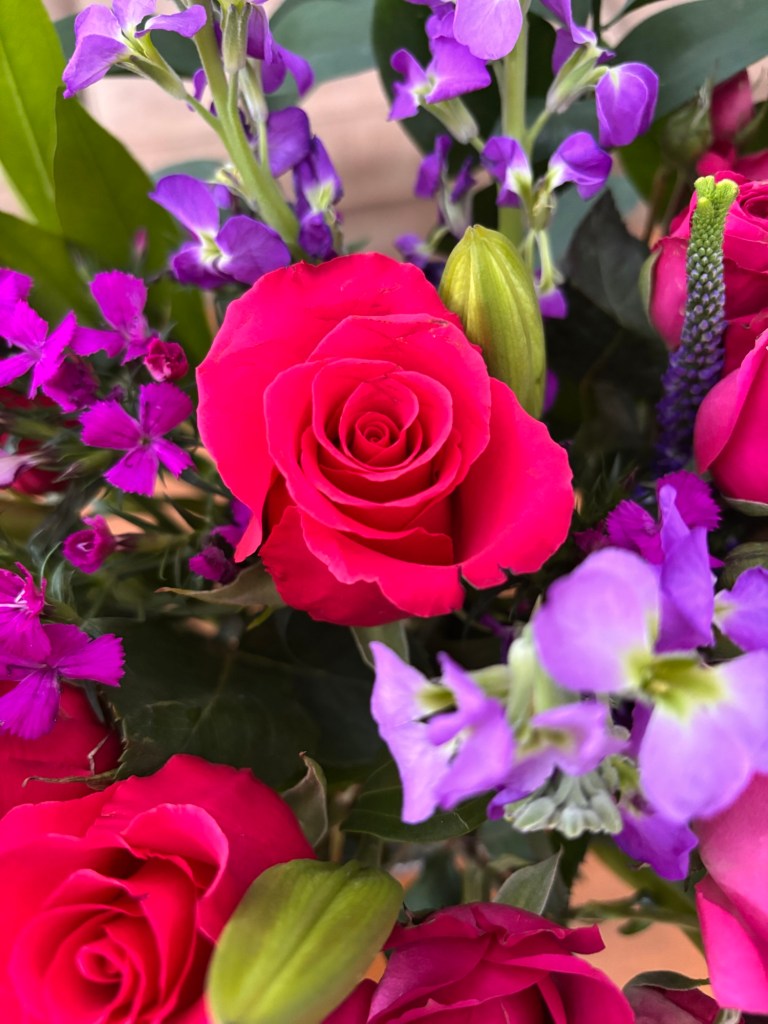
February flowers from BloomsyBox.com
Did you notice that iPhone has hidden “portrait mode” in a new place? I had to Google where to find it.

Watercolors—botanicals 9

Almost done with my Watercolor Workbook by Sarah Simon.

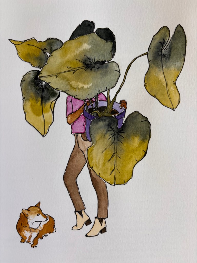
“Lady Monstera” and her little dog 🐶
Berries and Cyprus

I painted the center flower as one big wet boundary, but I think it might’ve looked cooler if painted each petal separately. Would’ve taken longer though!

Watercolors—botanicals 8

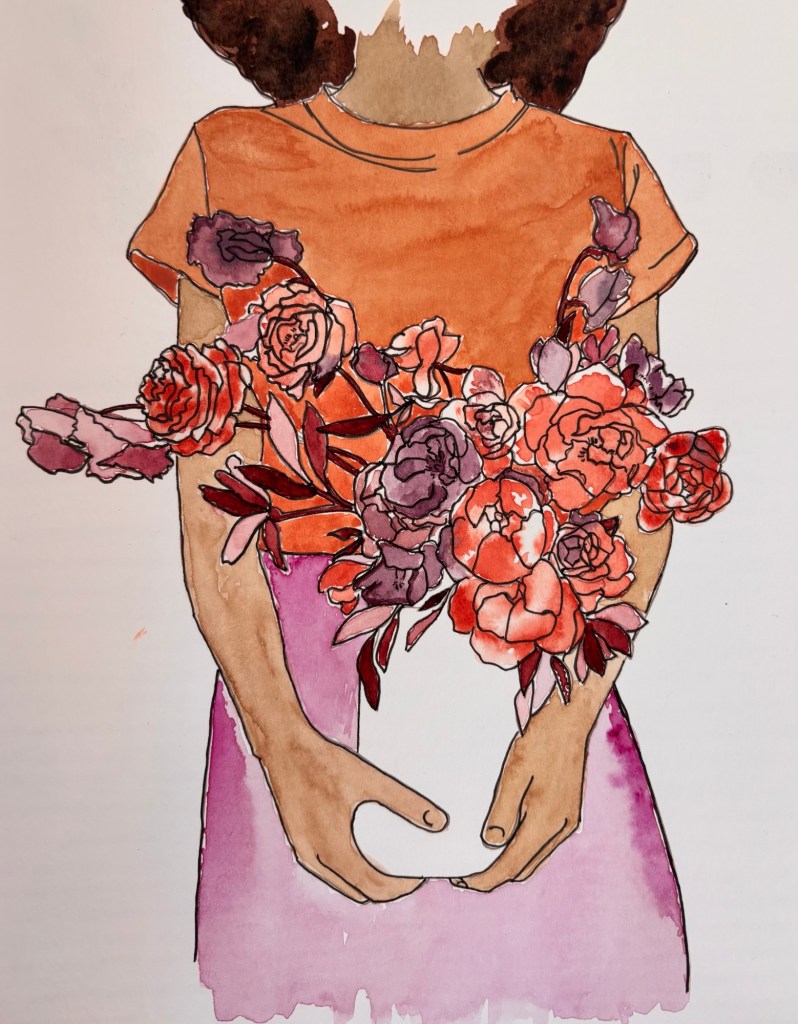
Garden bouquet. I was trying to paint in the “loose boundaries” style here, but then my husband said the middle flower looked boring so I put some table salt in a few areas.
Another anonymous woman from the workbook. She is called “Lady Wisteria.“
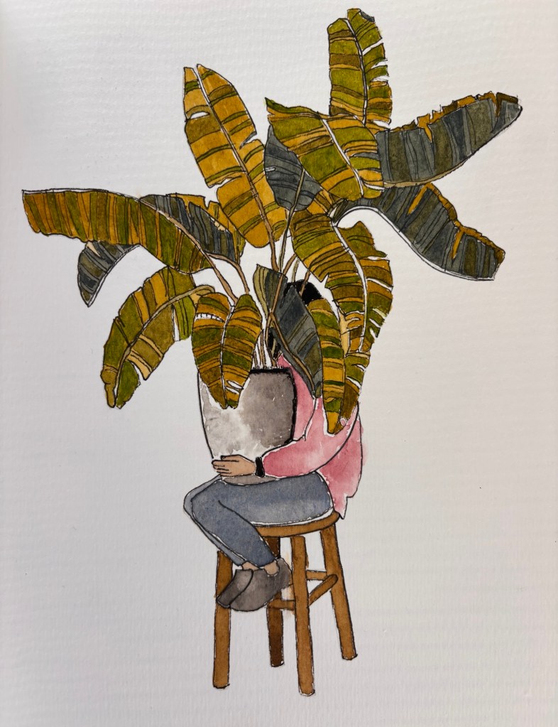
“Lady Banana Plant” is very shy indeed!

Designs from Watercolor Workbook by Sarah Simon (IG: @themintgardener)

Watercolors—botanicals 7

This headless design is called Lady Sweet Pea in my workbook.
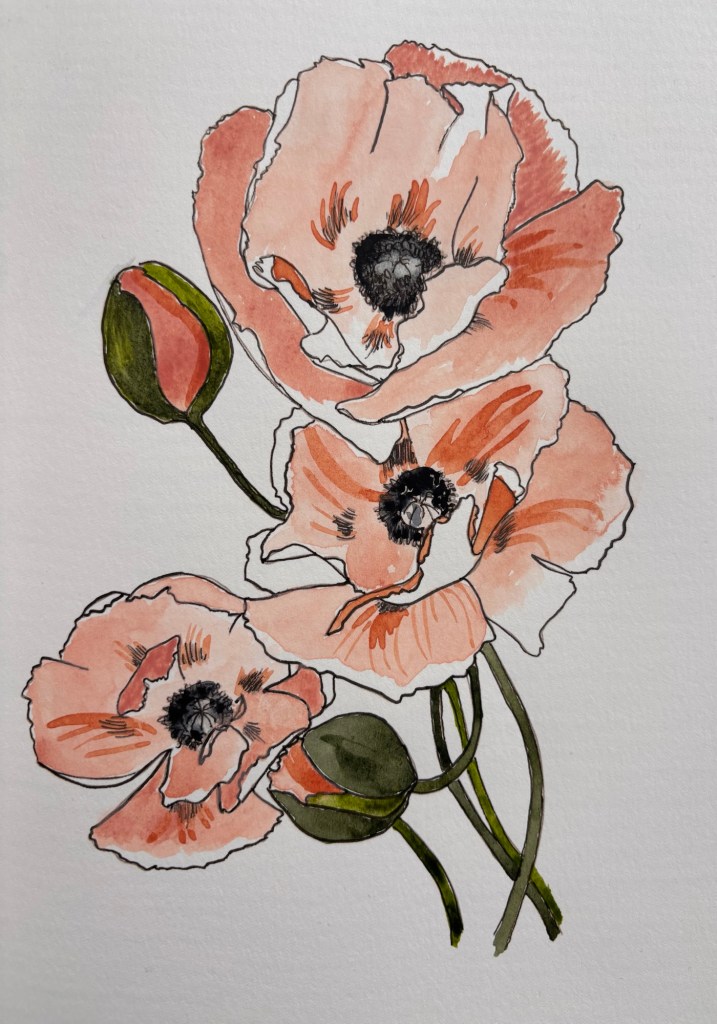
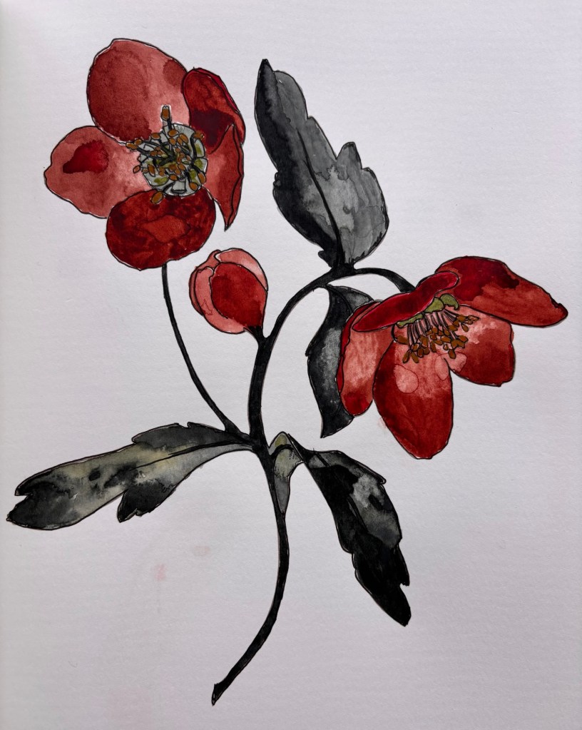
Poppies
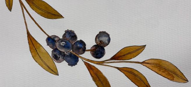
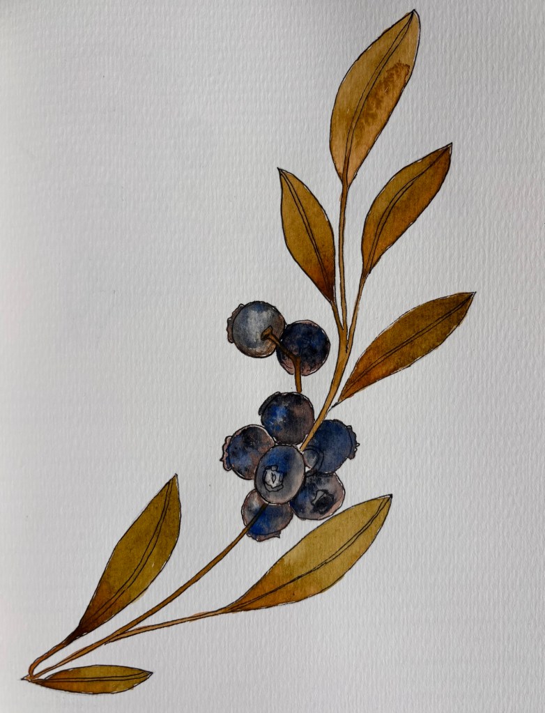
Blueberry branch. I think this is my favorite page in the workbook so far. I really like how the blueberries came out.

Designs from Watercolor Workbook by Sarah Simon (IG: @themintgardener)

Today is my husband’s 64th birthday, which is significant to GenX and older because he’s officially reached the Beatles definition of old age:

“Will you still need me, will you still feed me, When I’m sixty four?”

Also, I hear there’s football a game going on during a Bad Bunny concert tonight. 😉

Go Pats!

Watercolors — more botanicals

OK, so my artists pens came and I was able to outline the designs. I intentionally left some small edges unpainted as highlights.

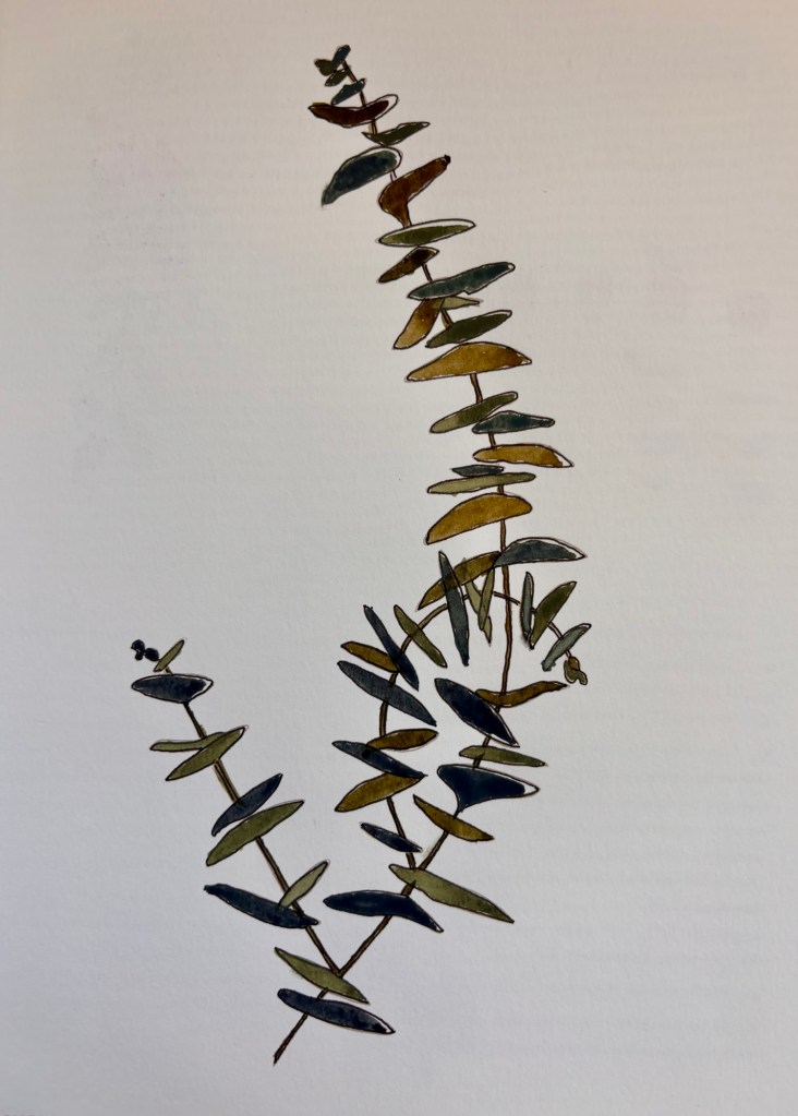
Round leaf eucalyptus

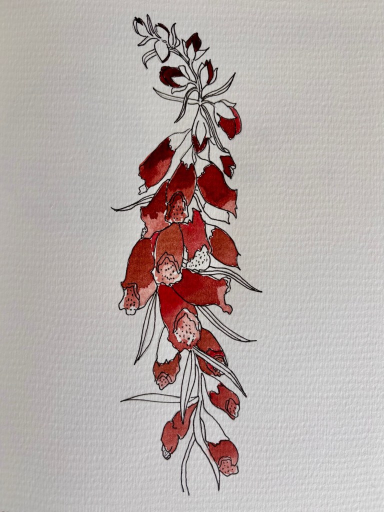
For the next one, the workbook offered two options. Leave the leaves and stems unpainted:

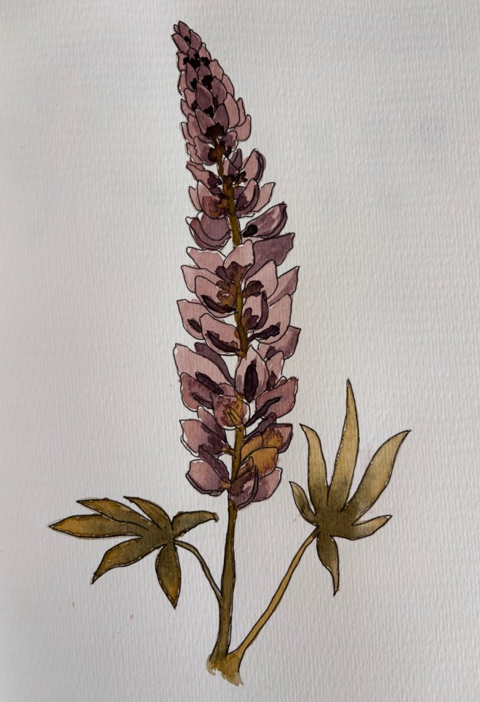
Foxglove

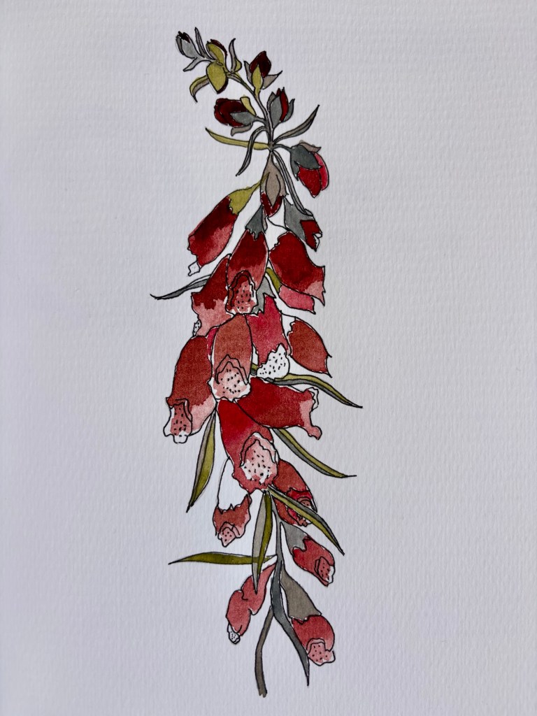
Or wash them with three different colors (slate, sage and stone):

Foxglove

My husband says the first one looks unfinished, but I kind of like it better. Do you really need to have every bit of the surface painted to give the vibe of a certain plant?

Watercolors – botanicals

I’ve run into a bit of a problem with my Watercolors Workbook. The book is designed to have you ink the outlines of the various botanicals before painting. I did that with my pen and ink set, but too late discovered that my ink is not waterproof! The ink went everywhere once I hit it with the watercolor paint. I decided to try inking AFTER painting but I don’t love the result:

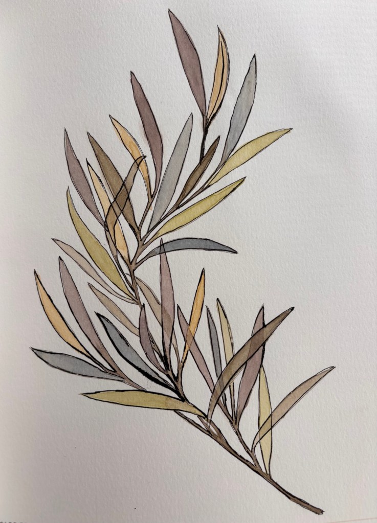
Long leaf eucalyptus. You can see that the ink was hard to control in some areas.

I then tried one without inking at all. It’s OK, but I decided to go ahead and order some waterproof black artists pens, as the author suggested.

Dahlia

I like some of the techniques I learned doing the eucalyptus and the dahlia: leaving some areas white to highlight; darkening petal bases with wet in wet color (dark into light); and layering over dry paint with a different color for a cool, translucent effect.

Hopefully my new pens arrive today.