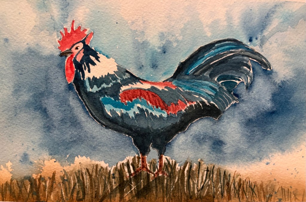
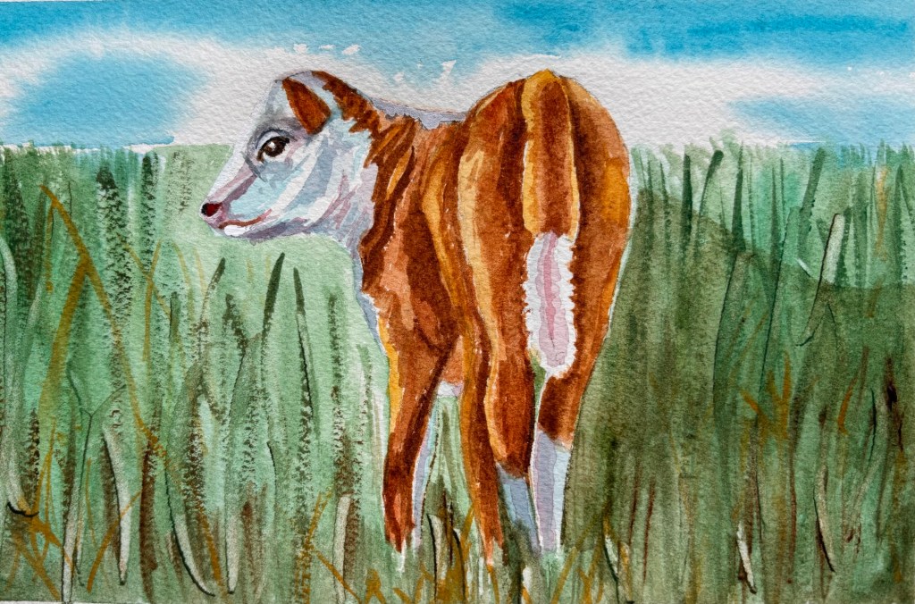
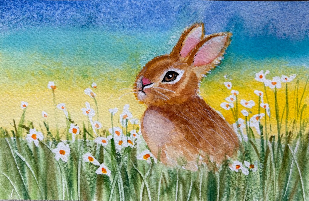
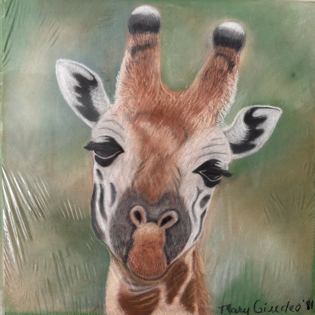
OK, last farm animal from my 5-week paint-along class and it’s not a baby! It’s a full-grown cock 😜
The teacher asked me point blank if I plan to return for the next session, which was awkward. I mean…I had some fun and learned a few things, but this paint-along-with-the-teacher style class is not really for me. I asked her to “please keep me on the mailing list.” Maybe I’ll return if she chooses a subject I really want help with, like sunsets.
Thank you to my very awesome WordPress blog friends who have patiently looked at all of my BFAs.
🙏🏼
By the way, “Old MacDonald Had a Farm” is one of my granddaughter’s favorite songs and I absolutely love singing it with her. It’s fun to take a long pause before you sing the next animal’s name. It adds drama and excitement!
Next week is the last week of my paint-a-long class. It’s been fun, but I don’t think I’ll take the class next session. I prefer to choose my own subjects.
Week 3 of my paint-a-long class and I’m definitely getting flashbacks to high school—probably because the teacher is a retired high school art teacher. She talks to us like we’re 16, rather than 60+, sometimes. You can tell that she was one of those slightly grouchy teachers that was easily annoyed. It’s actually funny some of things she says to people: “Your perspective is totally OFF” or “I see you’re doing it your way—again”
Nobody seems to care. They’ve all known her a long time and they like her. They sign-up for her class semester after semester.
So far, she’s been pretty nice to me. No major criticisms and some nice compliments on my work. Just like in high school, art teachers like me.
Oh, and she plays the radio in the background while we paint. The station is perfect for us…it’s all soft rock from the 70 and 80s (our high school years). Some people sing along quietly.
I’ve been through the desert on a horse with no name…
Yesterday I went to a “pastel painting demonstration” at my town’s community arts center. (This is not the center where I’m currently taking a watercolors class OR the one where I took a class in the fall. I guess I’m lucky to have three different community arts centers within striking distance of my house!)
People reference “pastels” a lot and I know there are many different types—hard, soft, oil, etc. (Years ago, when I was a teenager, I worked with pastels and enjoyed them. I think they were primarily soft pastels back then, but I’m not even sure.)
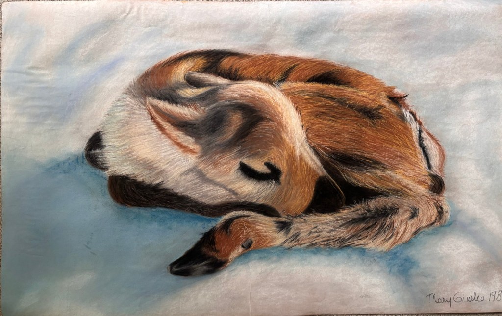
Huge pastel fawn that I did in high school
I had been thinking about trying pastels again, so when I saw the free demonstration advertised, I went. The artist “painted” a deer. (When I asked why he called it “painting” when I always thought of pastels as “drawing,” he said that it’s because pastels are the most pure/intense form of pigment. So even though you don’t use brushes, it’s called Pastel Painting.)
He started with a pencil sketch on UART sanded paper (400) and then added “hard pastels” as the first layer (he called it “the under painting”)—marking out the major color areas of the piece. He worked from dark to light (opposite of how most do watercolors). Then, he used a fairly big square brush dipped in rubbing alcohol to sort of smudge it all and work the major shapes. The alcohol dries quickly.
Then, he moved to soft pastels—and he had boxes upon boxes of them. Every color imaginable! “Ludwig” seemed to be his favorite brand (quite expensive). He used the soft pastels as the top layer to really define the piece and give it depth and beauty. He spent a lot of time on the face because he wanted that to be the focal point.
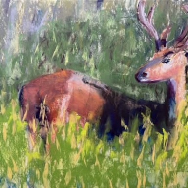
Pastel deer from a demo by professional artist John Forcucci
The artist had been primarily a watercolorist when someone gave him a “plein air” (outdoor) pastel class as a gift and he fell in love with the medium. Sometimes he combines watercolors and pastels. Many of his finished pieces were on display in the gallery at the arts center and some were really impressive. He mostly paints animals in the wild.
My thinking now is this:
Pastels look fun and I might like to try them again someday, but not now. I’m not ready to invest in the supplies and the dust they create is somewhat of a concern (both because of the mess and the potential toxicity).
I like the idea of painting “plein air” (outdoors) at some point, but that would require me to purchase an easel and other supplies. I’ll keep my eyes open for a workshop or other class that’s not too expensive. In the meantime, I have a full set of colored pencils, I should really just head outdoors with those and do some drawing, when the weather gets warm.
Bottom line: you can spend all kinds of money on fancy, new-fangled art supplies but they might not help you become a better artist. The only way to do that is practice. I feel I should keep working with the supplies I have and see where things go.
The other “problem” with pastels, is that you really need to put them behind glass (with separators) if you want to display your work, which is expensive. Watercolors typically require glass frames too, but at least you can just stick them in cheap frames from Michael’s. Pastels have a delicate, powdery surface. (In the old days, we sprayed our pastels to set them, but this artist strongly discouraged that.)
Still, pastel paintings can be absolutely exquisite and unique. Check out @CindyCrimmin on Instagram for some truly stunning examples of pastel painting.
If you read this to the end, thank you! I’m basically thinking out loud here. I feel like my blog is turning into a retirement journal and is very boring to anyone but me.
I started my 5-week class at a very nearby community arts center yesterday. I don’t like the set-up as much as the fancier arts center where I took my first watercolors class in the fall. The room is nice and sunny, but it’s quite crowded and no sinks. You have to use the restroom in the hall to get water and rinse your brushes.
The people seem nice. It’s a similar vibe to my first class. Lots of retired people who re-register each semester because they like the teacher and have gotten to know one another.
The difference is that we all paint the same subject each week, with the teacher giving a demo for each step. It’s not exactly a recipe for developing one’s own unique creative voice, but I’m sure I’ll learn some stuff by painting along with a pro.
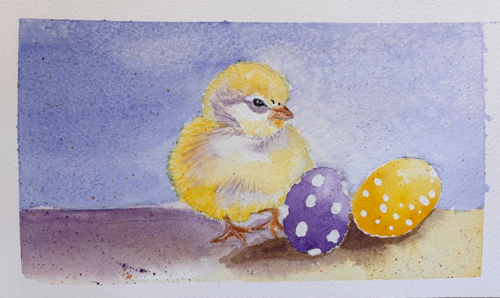
It’s surprisingly hard to make a chick’s face look “not mean.” I think the spotted Easter eggs help a bit.
We’re in a blizzard here in Massachusetts. Fortunately the power is still on, but we ain’t going anywhere for a looooong time.
Settling in.
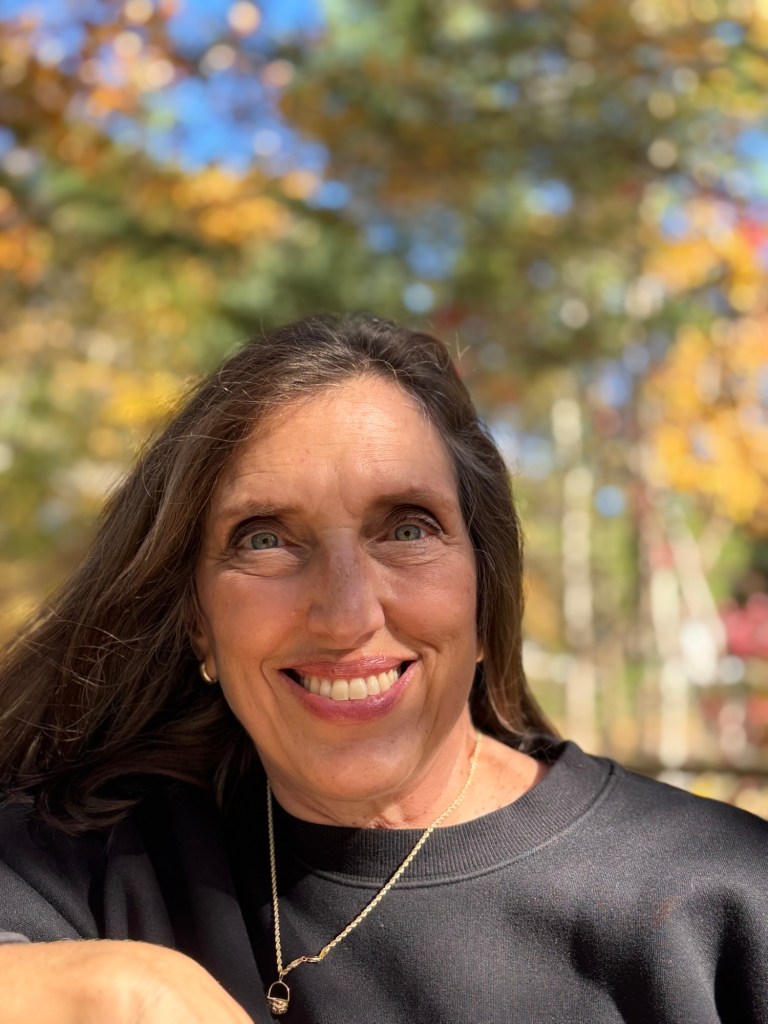
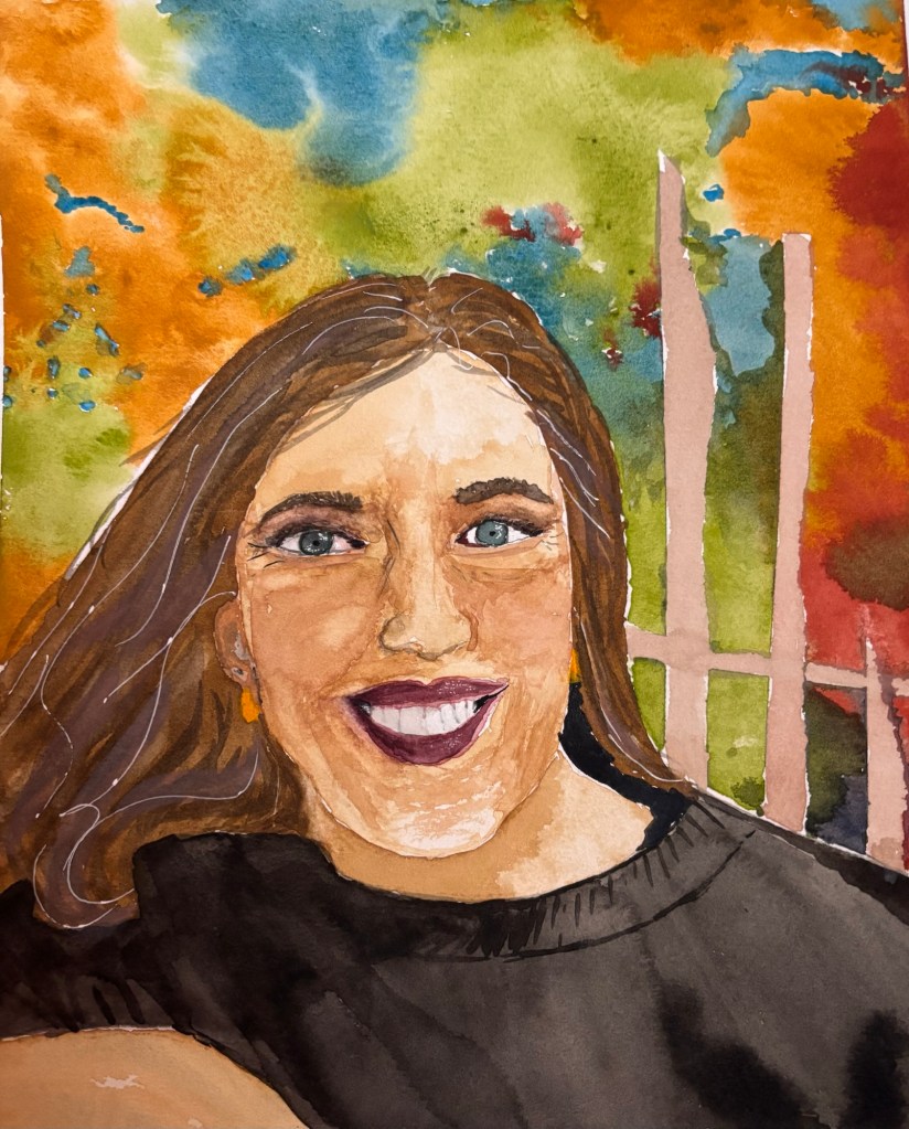
I decided to try painting another portrait (my own) based on a photograph.
Here’s the inspo pic from last fall:
Here my painting:
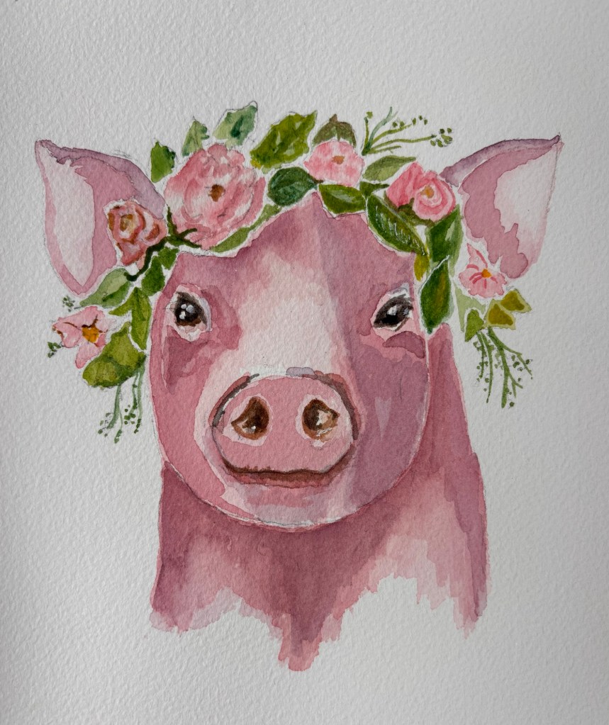
Portraits are hard! This makes me want to take another class with my teacher from last fall. She was good at portraits, but alas, I have registered for a different (cheaper) class, closer to home, where we will focus on “cute baby farm animals.”
ChatGPT gave me some solid feedback on the portrait though:
Lightly mapping planes (forehead plane, side planes of nose, cheek planes) before committing to color would increase dimensional accuracy.
The biggest difference between the painting and photo is contrast and value structure.
The photo has stronger: Shadow under the brow ridge Shadow on the right side of the face (viewer’s right) Cast shadow under the nose Subtle shadow under the lower lip
In the painting:
Midtones dominate. Shadows aren’t quite dark enough, especially around the eyes and under the cheekbones. This reduces form and depth.
Fix: Push darks 15–20% deeper in:
Eye sockets Side of nose Under cheekbone (viewer’s right side) Neck shadow under chin
That alone would dramatically increase realism.
Biggest Growth Area:
Value structure and form modeling
If you deepen shadows and increase plane awareness, this would jump from a good portrait to a very strong one.
OK, I can take that criticism (nicer than some human art teachers I’ve known) and I agree with it.
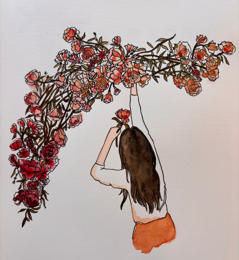
These are the last few pages in my botanicals “Watercolor Workbook” by Sarah Simon, a very thoughtful Christmas gift from my daughter.
It was great because it kept me painting through January and February in this very cold and snowy Winter of the Knee, where we’ve mostly just stayed home. (Part 2 of The Year of the Knee—aka “The Other Knee”—is now scheduled for March 16. 🙄)
I enjoyed inking the pre-printed designs with my new artists pens and learned a few good techniques for painting flowers and foliage. Also, I got a lot of useful color mixing information. Each page preserves my color recipes, which will be convenient for future reference.
Finally, hurray for flowers and plants! I’m bad at growing them, but they’re fun to draw, paint. and photograph.
🌺🌿🌷🌻🌼🪴🌱🌸
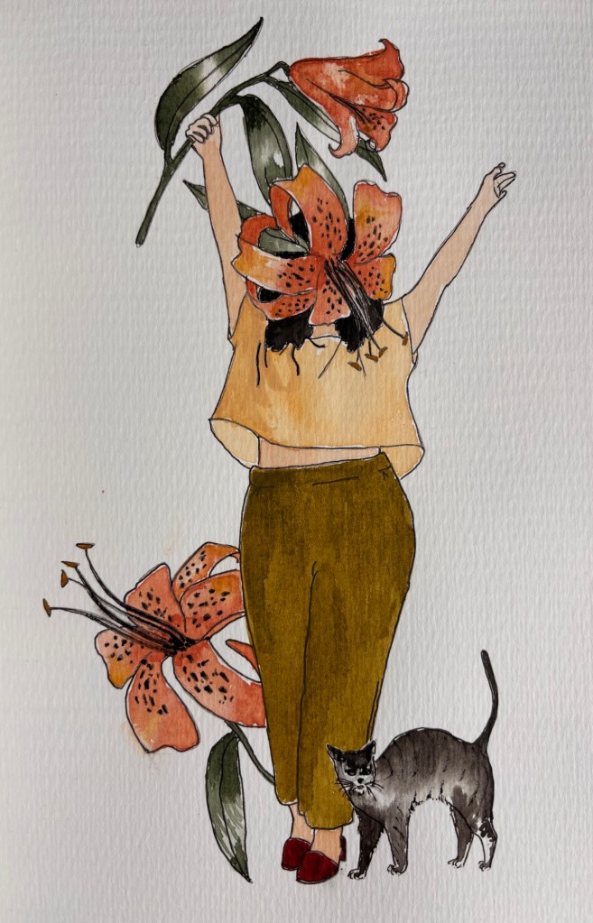
“Lady Lily” and her little cat 🐈⬛
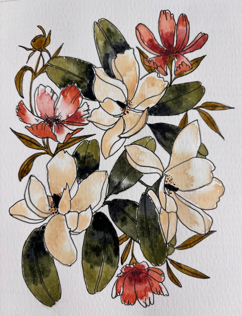
Cosmos and Magnolias
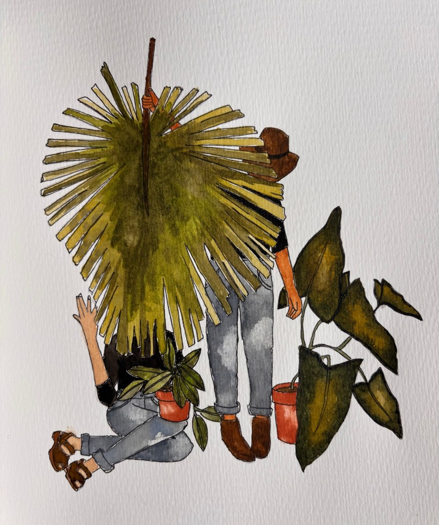
This design is called “Plant Lady Besties” 😊
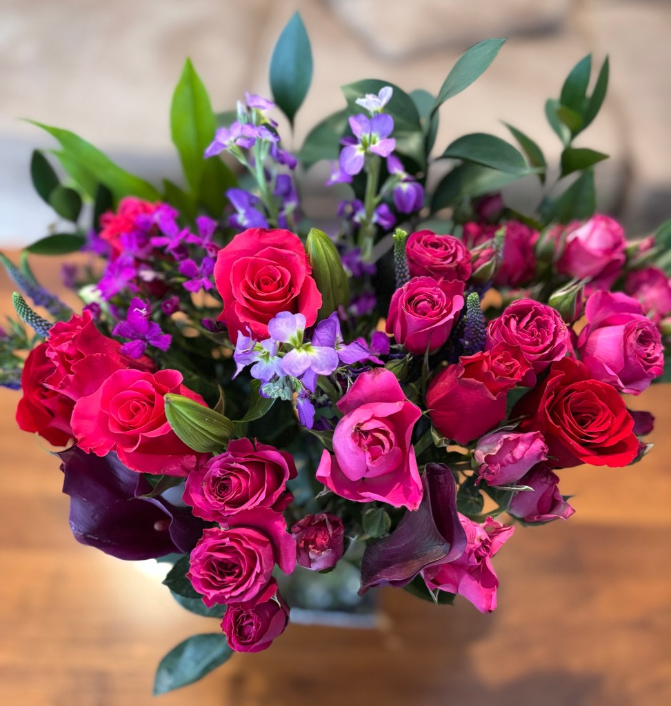
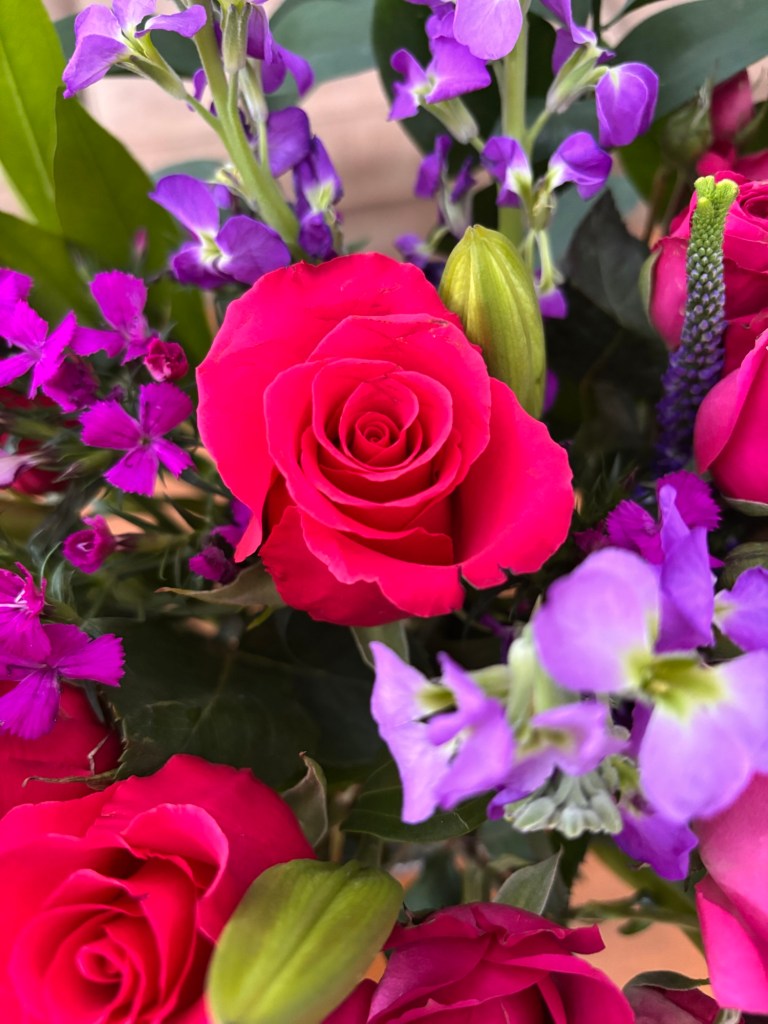
February flowers from BloomsyBox.com
Did you notice that iPhone has hidden “portrait mode” in a new place? I had to Google where to find it.
Almost done with my Watercolor Workbook by Sarah Simon.
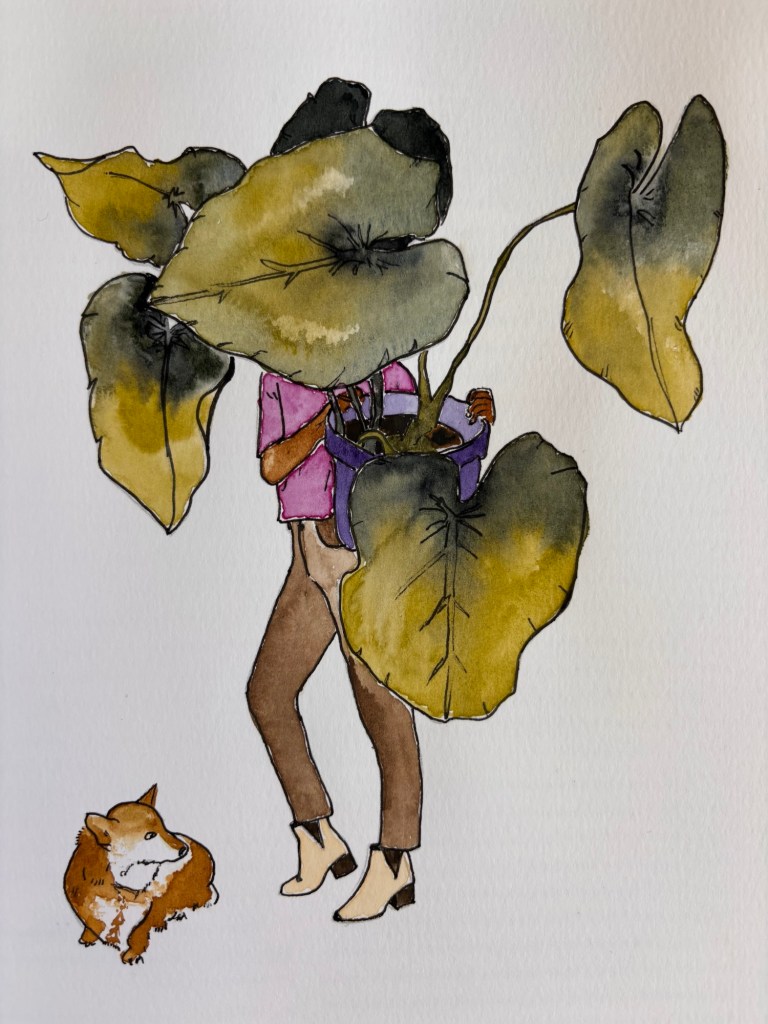
“Lady Monstera” and her little dog 🐶
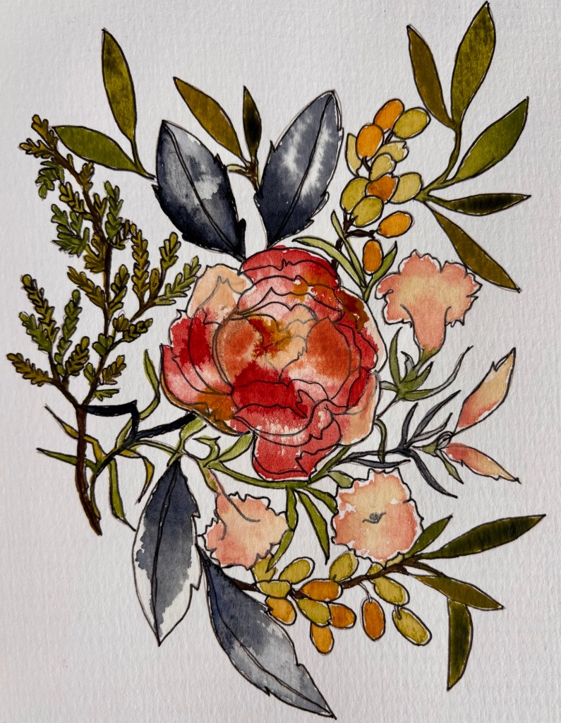
Berries and Cyprus
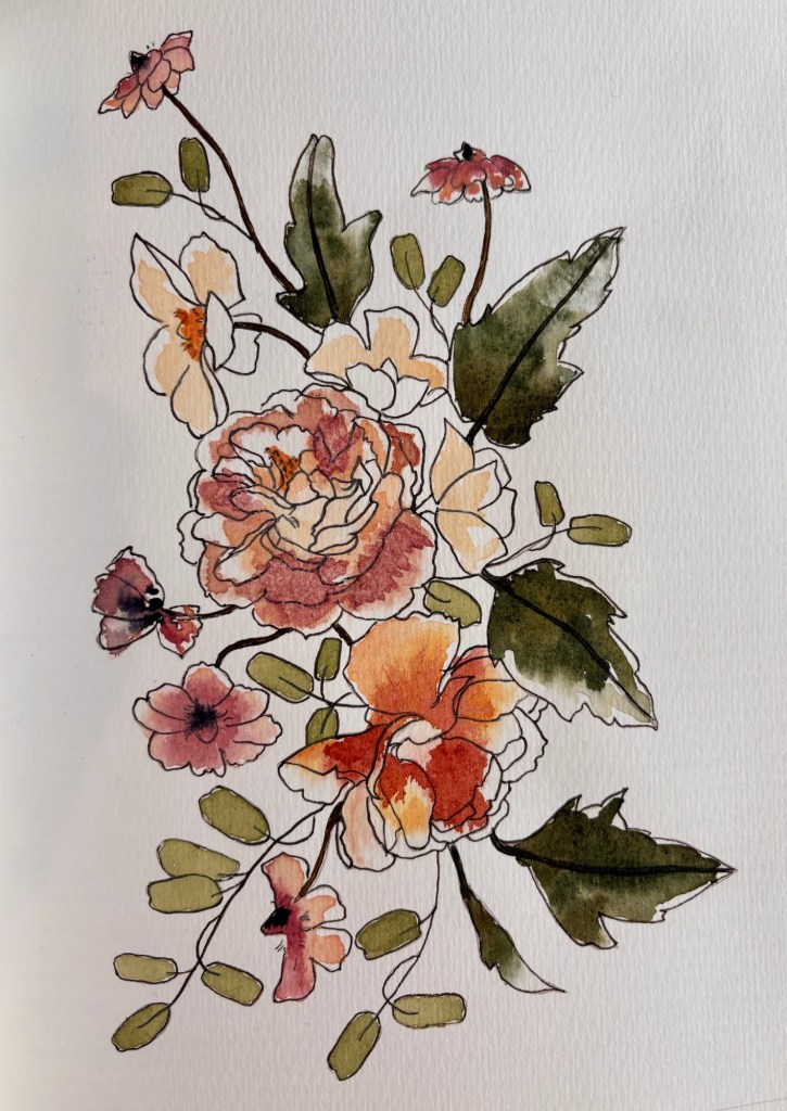
I painted the center flower as one big wet boundary, but I think it might’ve looked cooler if painted each petal separately. Would’ve taken longer though!
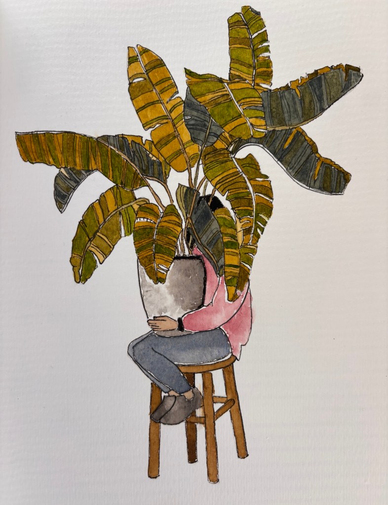
Garden bouquet. I was trying to paint in the “loose boundaries” style here, but then my husband said the middle flower looked boring so I put some table salt in a few areas.Another anonymous woman from the workbook. She is called “Lady Wisteria.““Lady Banana Plant” is very shy indeed!
Designs from Watercolor Workbook by Sarah Simon (IG: @themintgardener)
![A logo for "50 Happens," [a site dedicated to Gen X women with children and grandchildren] [who embrace life's challenges with humor and resilience], [featuring a modern and uplifting design] [that embodies strength and positivity] [with an elegant and playful style] [and a harmonious blend of colors like pink, fuchsia, purple, and blue].](https://50happens.blog/wp-content/uploads/2024/12/img-5uorrxvwartomopcpuhjfjd0.png?w=300)