With the Milan-Cortina Olympics about to start, we’re going to be seeing many shots of Milan’s iconic Gothic-style Duomo.
This reminds me that I visited Milan in 1985 with my friend Julie during our semester abroad in Italy. We climbed up to the rooftop terraces of the Duomo. Back then, you didn’t need reservations or special tickets to go up.
I love it when photographic evidence of my foggy memories actually exists!
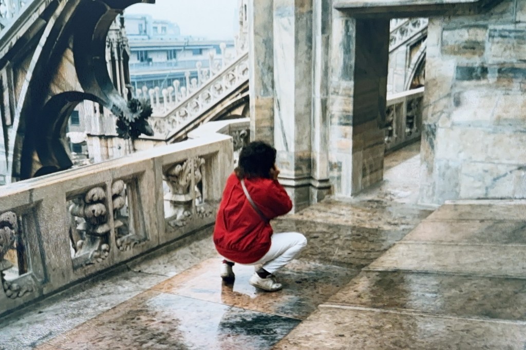
Here’s a photo I took of Julie taking a photo through a doorway atop the Duomo in Milan 40+ years ago. Julie is a great photographer so I’m sure she got a wonderful, artistic shot. But I like my pic too. Her red coat looks cool. And you can see some of the over-the-top decorative elements of the roof. Those endless spires remind me of wet, drippy sandcastles.
This is the first winter in forever that I’m not going to Florida for at least a week. I’m staying here in the cold with my husband—and his new knee—for the entire winter. And it sure is a cold and snowy one. We have a huge snow bank in our driveway and major icicles hanging off our roof. I’m worried about ice dams causing leaking into the house (so far, so good).
There’s a garden under that huge pile of snow. The plow guy has no other place to put the snow. I hope at least some of the plants survive.
On the bright side: I get to see my granddaughter today 😁 Also, the Patriots are in the Super Bowl, which is a big plus if you’re married to a huge Pats fan. The Super Bowl is on his birthday too. Also, my church is hosting an Emma’s Revolution concert Friday to benefit a local immigrant and refugee justice organization. It’s going to be fun.
Yesterday, I watched some of the congressional testimony from people whose lives have been ruined by ICE, including Renee Good’s two heartbroken brothers. Not a single Republican congressperson attended the hearing. I watched Aliyah Rachman—a woman with a traumatic brain injury—testify to the most horrific capture and treatment by ICE that you could possibly imagine. The conditions in the detention centers are subhuman, with living human beings referred to as “bodies.” Watch her testimony here.
My husband has signed on to get his other knee replaced in mid-March, so that’s going to….in a word…suck.
But back to the bright side: we moved an old treadmill from the unfinished side of the basement to the “nice” side of the basement and it still works fine. So I can “take a walk” even when the weather prevents me from going outside. I’m currently rewatching the entire originalSex and the City series while I’m treadmilling. I’m on Season 3.
I’m getting closer to the end of my watercolor botanicals workbook and I decided I’d like to keep learning in a class with a teacher. Last night I found a class at a different community arts center (even closer to my house than where I took my first watercolors class last fall). There was just one opening left, so I registered. I had hesitated to register earlier, because the class focuses on learning to paint one particular subject, which sounded kind of silly. But last night as I watched All Creatures Great and Small on PBS, I decided that painting “soft, cute and fluffy baby farm animals” might be just what I need in the Winter of 2026.
Peony and wildflowers from my Watercolors Workbook
I watched almost all of the Grammys on Sunday night and I really enjoyed them, even though I didn’t know most of the music.
I always like Trevor Noah—the host. (Everyone should read his memoir “Born a Crime” about growing up as a biracial kid in South Africa.) I thought Trevor’s jokes were funny and not too mean. Our whiny-ass, thin-skinned President is suing Trevor over one mention of him in connection with Jeffrey Epstein, even though Trump’s name is reportedly in the newly released Epstein files over 1,000 times!
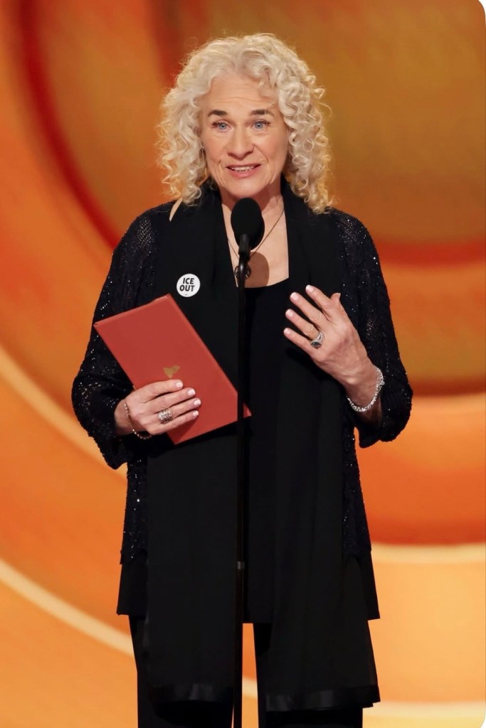
I liked the fact that the diverse array of artists who took the stage didn’t shy away from talking about what’s going on in the country. Many wore black & white “ICE OUT” pins, including the legend herself—Carole King.
Carole King, one of the all time greatest songwriters
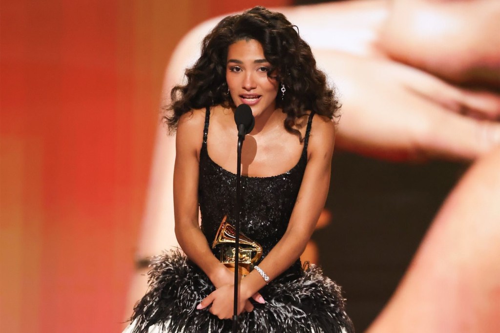
The highlights for me were Olivia Dean and Bad Bunny’s acceptance speeches. Here’s what they said:
Best New Artist Olivia Dean:
“I guess I want to say I’m up here as a granddaughter of an immigrant. I wouldn’t be here — I’m a product of bravery, and I think those people deserve to be celebrated. We’re nothing without each other. Thank you so much.”
I did a little research and learned that Olivia Dean’s maternal grandmother was born in Guyana and emigrated to the United Kingdom as part of the “Windrush” generation — a post-World War II movement of Caribbean migrants invited to Britain to help rebuild the country. They arrived in Britain between 1948 and the early 1970s on ships like the Empire Windrush.
Bad Bunny, who is Puerto Rican, spoke movingly from the heart. He opened his first acceptance speech by saying “ICE OUT,” which got a standing ovation. He then said, “We’re not savage, we’re not animals, we’re not aliens. We are humans, and we are Americans. Hate gets more powerful with more hate. The only thing that is more powerful than hate is love. So please. We need to be different. If we fight, we have to do it with love. We don’t hate them. We love our people, we love our family, and that’s the way to do it, with love.”
I didn’t stay up to see him win Album of the Year (the first time ever that a Spanish language album got this award), but when I watched later I saw that he dedicated the award “to all the people who had to leave their homeland, their country, to follow their dreams.”
I mean, come ON, if you didn’t love Benito before, you gotta love him now! I really can’t wait to see what he does for the Super Bowl halftime show. Check out the teaser he dropped yesterday.
We already know that Trump and all the American traitors who support him are not in favor of a Latino performer at the Super Bowl, but I think it’s going to be great and just what the country needs.
I will be rooting for the New England Patriots because that’s our team, but I’m not happy that owner Robert Kraft was seen with Trump at the opening screening of the ridiculous “Melania” documentary vanity project. Bad Kraft!! Very Bad!
My own immigrant grandparents, circa 1925
In 1905, my grandfather bravely left Southern Italy alone at age 15 with $12.00 in his pocket to start a new life in the United States of America. Just like Olivia Dean said, “I am a product of bravery.”
Of all the unexpected bad news out of left field, Catherine O’Hara suddenly passing at age 71 made me cry OH NO at top volume.
Like literally everyone else, I LOVED Catherine O’Hara.
There are currently about one million tributes to Catherine online, so I’m just going to pick one favorite memory to share and that is: I honestly don’t know how we would’ve made it through the pandemic lockdown without Schitt’s Creek and Moira Rose. She was such a bright spot during that awful time. I absolutely loved all of the scenes involving the Women’s Choir (probably because I’m a lifelong Choir Lady myself), but remember her audition? The bizarre scat singing and the shaker egg in one hand. 🤣 How on earth did she come up with that? I often wondered how the other actors made it through even one take with Moira Rose without cracking up.
Thanks for the laughs Catherine, but you left us way too soon! There are so many other Baby Boomers that should’ve gone before you (especially the one in The White House). NOT FAIR. I was so looking forward to seeing you in Season Two of The Studio and whatever else you ever decided to do.
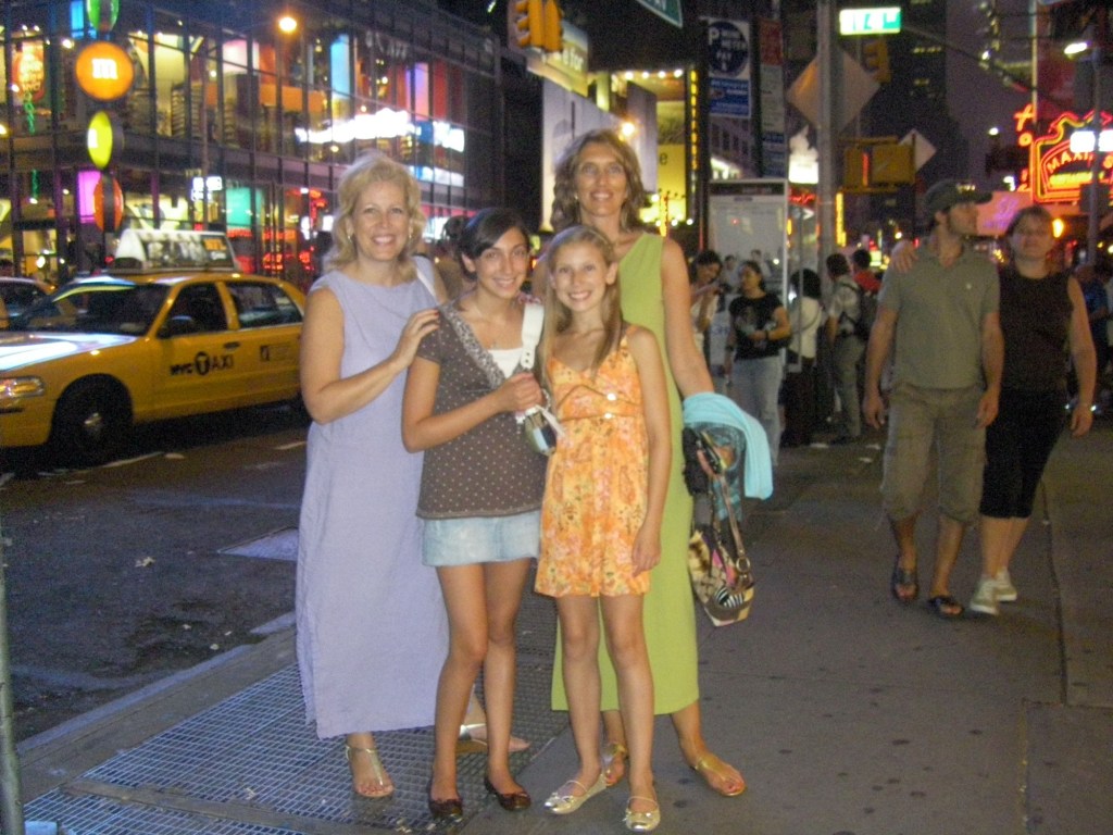
Have you ever received a casual invitation that was likely not meant sincerely? You know, something like “you should come visit sometime”? Welp, I got one of those once and I decided to take the person up on it.
My husband’s cousin (an interior designer) and his husband (an investment firm VP) live in a very fancy Manhattan coop in Murray Hill. We saw them at a family gathering in Massachusetts in 2008 and they “encouraged” us to visit. Looking back now, I really don’t think they meant it. They were childless city folk and we had young kids.
Anyway, I reached out that summer because my friend and I wanted to go to NYC to see Legally Blonde on Broadway with our daughters and get this—they offered us their apartment for the weekend! They were going to be at their “country home” the weekend we were coming, but said we could stay in their city place by ourselves.
We couldn’t believe their place. First of all, it was HUGE. Second, it was decorated in the least kid-friendly way imaginable. There was glass everywhere, Nothing was left out on any surface, everything was completely smooth. There were sculptures (mostly of gorgeous male bodies) on pedestals that would have been deadly if knocked over.
It was actually comical. We were so afraid of breaking anything that we barely moved! At one point, I remember hunting for a coffee maker in their exquisite, smooth-surfaced kitchen (a note said it was in “the appliance garage”) but then just giving up and going out for coffee.
This interior hallway door gives you the vibe of the place—smooth, orderly and very adult.
The huge living room/dining room area
Sculptures on display
A bathroom
The girls sitting very carefully in the HUGE living room (remember this is in midtown Manhattan)
The smooth and baffling kitchen where I couldn’t figure out how to make coffee
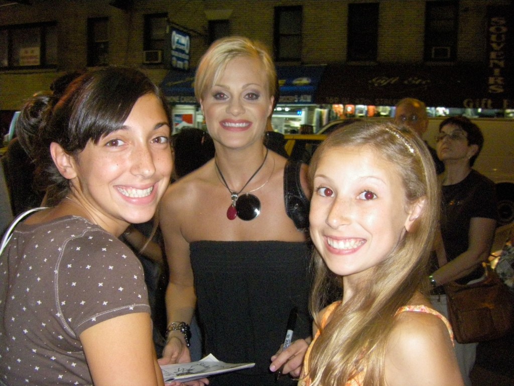
Getting cast autographs after Legally Blonde
A fun weekend—and we left that apartment just as we found it. Nothing broken 😅
I realize I’m not using Dan’s Thursday’s Doors in the usual way. I search my photo file for “door” and some door pops up that prompts a memory.
Check out the other cool doors here or just search for posts tagged Thursday Doors.
Thank goodness I found another indoor hobby besides reading and watching TV. Between the freezing cold weather and not traveling due to my husband’s knee, I needed something.
Even though I’m working with someone else’s designs at the moment, I’m definitely learning some stuff from this book/teacher.
Daisies
Kind of a weird design called “Lady Rose”
Mark your calendars: The next mass anti-Trump NO KINGS protest will be March 28, 2026.
Here’s the message from the national leadership of Indivisible:
“Our mobilizations grew from month to month last year, exploding from Hands Off in April (3 million) to the second No Kings Day in October (7 million) — and the regime’s ongoing brutality and authoritarianism in the months since have only convinced more Americans, including many who’ve never attended a protest in their lives, to join their neighbors in the streets. Now we’ve got to keep that momentum growing, with the same creativity and dogged determination.
Everything we’ve done so far, and everything we’ll be doing in the next weeks and months, is the stuff of history. And together, we’ll write the history of how, for the second time in 250 years, we the people defied, and overcame, a tyrant.”
The only thing that’s going to stop this authoritarian/fascist train is US—the people. Minnesota showed us that all people of good conscience (left, right and center) must get involved.
It’s a winter wonderland here in Massachusetts. No sign of the plow guy yet this morning, but the Patriots are going to the Super Bowl – again. Therefore many New Englanders (husband, son…) are in a much better mood than they otherwise would have been. Go Pats!
And some good news: our whiny-ass, murdering, rapist, senile, spray-tanned orange President has announced he’s not going to attend the Super Bowl because he doesn’t like the halftime performer. He’s probably afraid all those Boston and Seattle fans would boo him into oblivion. In any case, Long Live Bad Bunny!
I’m continuing to work my way through “Watercolor Workbook” by Sarah Simon. If interested, she’s on Instagram: @themintgardener. All designs are hers.
Buttercup Wreath I like how the “wet in wet” worked out in the lower yellow flower (upper flower was too dry when I added the darker color). I also like the berries. Author suggested droplets of paint rather than brush strokes.Fiddle Leaf Fig
Unfortunately my paint set doesn’t have one important color for botanicals: Oxide of Chromium. I’m having to make do with Sap and Veridian.
Wildflower Swag This is painted in the so-called “undefined boundaries” style. It’s fun to somewhat ignore boundaries and let the paint and water do what it will.
Alex Pretti, registered nurse, United States citizen
Statement from the family of Alex Pretti:
“We are heartbroken but also very angry.
Alex was a kindhearted soul who cared deeply for his family and friends and also the American veterans whom he cared for as an ICU nurse at the Minneapolis VA hospital. Alex wanted to make a difference in this world. Unfortunately he will not be with us to see his impact. I do not throw around the hero term lightly. However his last thought and act was to protect a woman.
The sickening lies told about our son by the administration are reprehensible and disgusting. Alex is clearly not holding a gun when attacked by Trump’s murdering and cowardly ICE thugs. He has his phone in his right hand and his empty left hand is raised above his head while trying to protect the woman ICE just pushed down all while being pepper sprayed.
Please get the truth out about our son. He was a good man.”
![A logo for "50 Happens," [a site dedicated to Gen X women with children and grandchildren] [who embrace life's challenges with humor and resilience], [featuring a modern and uplifting design] [that embodies strength and positivity] [with an elegant and playful style] [and a harmonious blend of colors like pink, fuchsia, purple, and blue].](https://50happens.blog/wp-content/uploads/2024/12/img-5uorrxvwartomopcpuhjfjd0.png?w=300)