OK, so my artists pens came and I was able to outline the designs. I intentionally left some small edges unpainted as highlights.
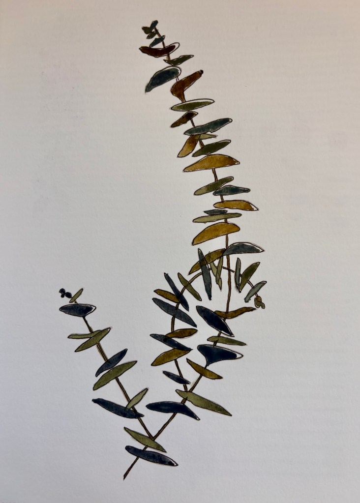
Round leaf eucalyptus
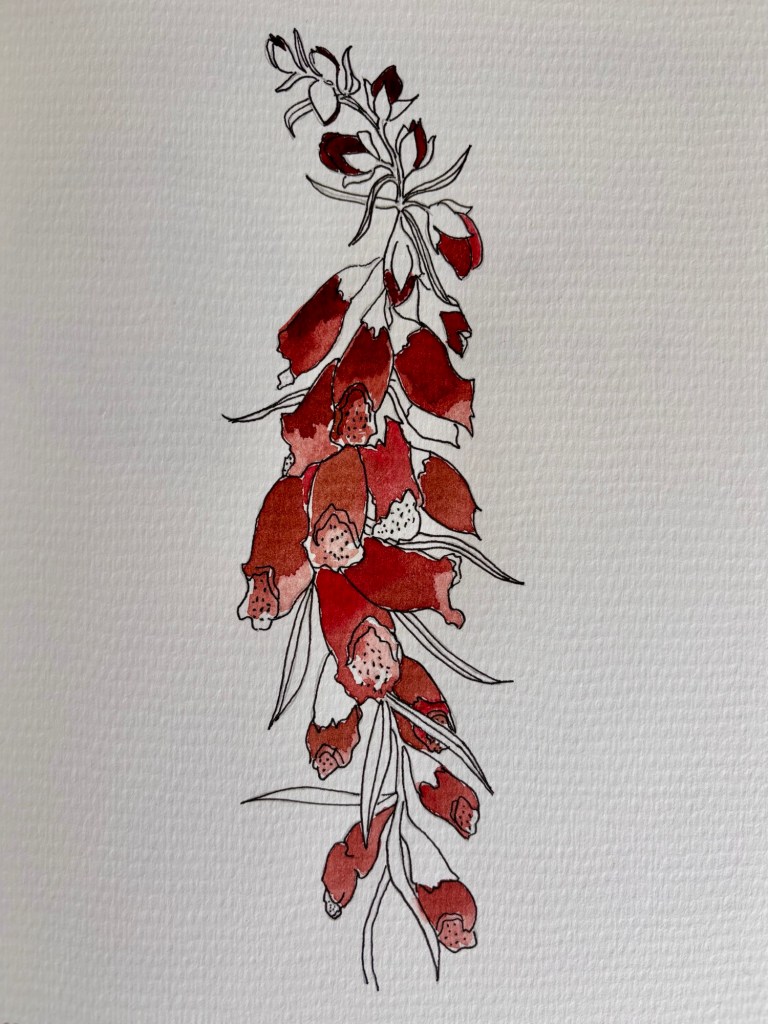
For the next one, the workbook offered two options. Leave the leaves and stems unpainted:
Foxglove
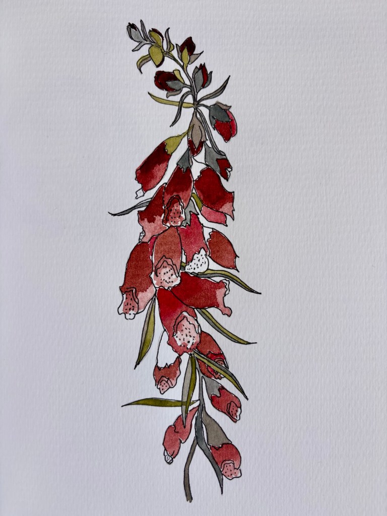
Or wash them with three different colors (slate, sage and stone):
Foxglove
My husband says the first one looks unfinished, but I kind of like it better. Do you really need to have every bit of the surface painted to give the vibe of a certain plant?
I’ve run into a bit of a problem with my Watercolors Workbook. The book is designed to have you ink the outlines of the various botanicals before painting. I did that with my pen and ink set, but too late discovered that my ink is not waterproof! The ink went everywhere once I hit it with the watercolor paint. I decided to try inking AFTER painting but I don’t love the result:
Long leaf eucalyptus. You can see that the ink was hard to control in some areas.
I then tried one without inking at all. It’s OK, but I decided to go ahead and order some waterproof black artists pens, as the author suggested.
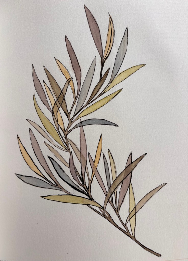
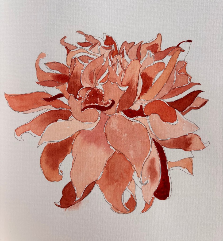
Dahlia
I like some of the techniques I learned doing the eucalyptus and the dahlia: leaving some areas white to highlight; darkening petal bases with wet in wet color (dark into light); and layering over dry paint with a different color for a cool, translucent effect.
As I posted about (a lot), I took a watercolors class last semester and really enjoyed it. I got a lot of nice feedback, both in person and from the very supportive readers of my blog. I put a couple of my paintings in frames (frames that I already owned—not new ones), and my daughter even hung one set of 5x7s on the wall in her living room.
I decided to register for another watercolors class this semester, with a different teacher. Even though I liked my teacher last semester, I wanted to try someone else because I feel like you learn different things from different teachers—especially in the arts. But, lo and behold, the class I chose was canceled due to under-enrollment. So, lesson learned: some arts teachers have followings. If you choose one who doesn’t have regulars (people who re-enroll each term), your class might get canceled.
Rather than scrambling to find another class, I took the refund.
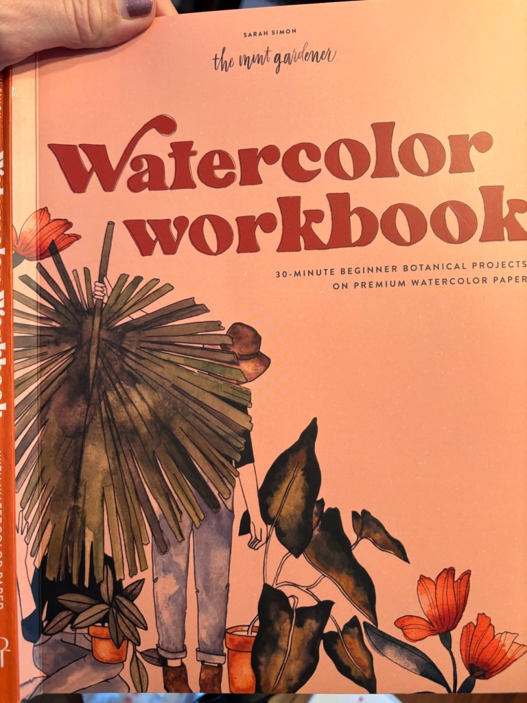
But, I do want to keep going so I’m doing a watercolor “workbook” that my very thoughtful daughter gave me for Christmas.
It focuses on botanicals (which is a sub genre of watercolors, like landscapes) and is fairly structured, compared to the free spirit teacher I had last semester. I’m sure I’ll learn some new things. First step was to swatch out all my colors and then mix new colors according to the author’s recipes.
Phew – I mixed all her colors using the paint set I already own. Most came out pretty close.
Yesterday was the last week of my 8-week class called “Loosen up with Watercolors” at our local (amazing) community arts center.
Against advice from the teacher, I attempted to paint a portrait of someone I know and love: my granddaughter. The reference photo (taken by my daughter) was from last summer when my granddaughter was 9 months old. (She’s walking now!)
I had the idea to use wine bottle webbing in the background for her playpen siding.
I had fun doing this, but I get why the teacher said not to paint family members as a total beginner. You’re too attached to the subject!
I want to learn how to make smooth skin tones, but I was too afraid to experiment on her adorable little face. I will try a stranger again next time, like that random chef from a magazine, which was my first ever watercolor portrait.
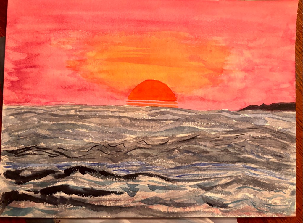
After my frustrating experience with complementary colors and sunsets, I made some gradients to try to better understand my color options.
I have no pink. Alizarin Crimson can work as pink when diluted or mixed with Purple Lake.
I decided I do not like Cadmium Orange and will avoid it in the future.
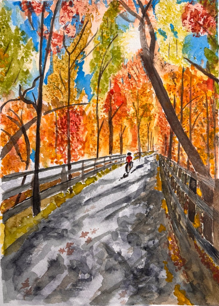
Today the teacher gave a dog portrait painting demo (something she earns money doing) and then everyone worked on whatever they wanted. I decided to go back to my rail trail painting and see if I can make it better by adding more layers. A woman loaned me a sea sponge for applying paint to get a certain effect (like fall leaves), so that was fun. I hope to finish that painting by the last class next week. I also want to try one more portrait before the end of the session.
Although there are definitely some shared techniques in watercolor painting (like lifting paint to lighten areas), a lot of the learning seems to come from trialanderror. Our teacher is self-taught and she swears she learned everything she knows (and she knows a lot) by just trying it. As she says, “it’s just a piece of paper.”
These are her top tips:
Painting Progressions
Light to Dark
Loose to detailed
Big to small brushes
Tealike to Creamy
90% to 10% of surface active painting to observing
**************************************
Update:
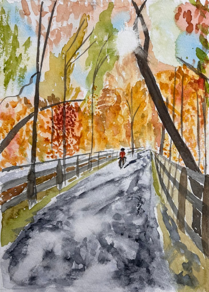
Here’s my “Rail Trail” with the additional layers. I do like it better now.
Each of the primary colors has a complementary color that you really want to avoid mixing with, at least for sunsets. If you put wet complementary colors near each other or layer them, you’re going to get brown. 💩
Red & Green = Brown
Blue & Orange = Brown
Yellow & Purple = Brown
That’s why my blue/violet to orange sunset sky ended up looking like a fried egg, especially from a distance,
The teacher said you can’t go directly from blue/purple to orange. You need some pink to transition.
She suggested using Alizarin crimson (not cadmium red) to make pink. It has blue undertones.
I tried again to get Key West sunset vibes, but without an ugly brown ring.
I’m not happy with the result. I really wanted a nice blended smooth gradient. The teacher said I painted “into it” too much. I need to try again, wetting the paper in both directions with my largest flat brush and then dragging the wet paint across in one direction only – end to end. In fact go off the paper with the brush.
Rather than masking, I could use a paper towel to lift out a circular moon or sun. (You can hold the paper towel in a round bunch and rotate the watercolor paper to create the circle.) And again, avoid complementary colors that will bleed into each other and make brown.
There are two classes left in this session and I need to decide what to do. I’ve been enjoying the class, but I’m not 100% sure that watercolors are my thing. But perhaps I should re-register and give it a bit longer.
One of the women who keeps re-registering is a very good watercolorist. She creates beautiful paintings of natural subjects like oyster shells and winter trees, and I can see that the teacher gives her good advice. Is that what I aspire to?
I am curious about both acrylic and oil painting, but those are more of an investment, and not as easy to whip out and work on at home.
Maybe I should take another drawing class and also re-up for one more 8-week session of watercolors. Maybe after that, I’ll feel confident enough in my drawing and color skills, to try working with real paint on an actual canvas.
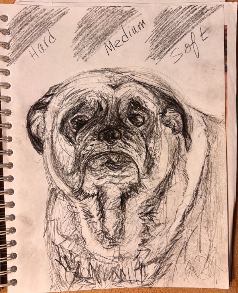
Charcoal pencil sketch of a pug (like Horace from Poldark)
On the other hand, 8 more sessions of watercolors is a lot, if I decide I’m not that into it.
***********************************
Update: Third and final try on this silly Key West sunset! Water colors are hard.
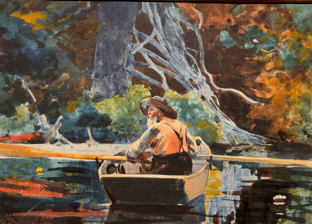
I dragged brought my husband to the special Winslow Homer exhibition at Boston’s Museum of Fine Arts. Given my recent interest in watercolor painting, I couldn’t miss Of Light and Air.
Here’s what I learned:
Watercolors fade. These paintings are delicate. That’s why they only display them once every forty years or so—and in very dark galleries. (If you really want to make art that lasts forever, watercolors might not be a great choice.)
One of the most famous (and vibrant) pieces in the show
Pencil lines are OK, as long as they don’t bleed into the paint. In fact, most of his works were described as “watercolor over graphite.” And being able to draw well really helps. Plenty of modern painters can’t draw, but most artists I admire draw well…really well. So, keep practicing or studying drawing.
Having started as a commercial lithographer and magazine illustrator, Homer could create a realistic image with just a few well-planned lines. In fact, one of his magazine employers sent him to the front lines of the Civil War to draw battlefield images. Talk about trial by fire!
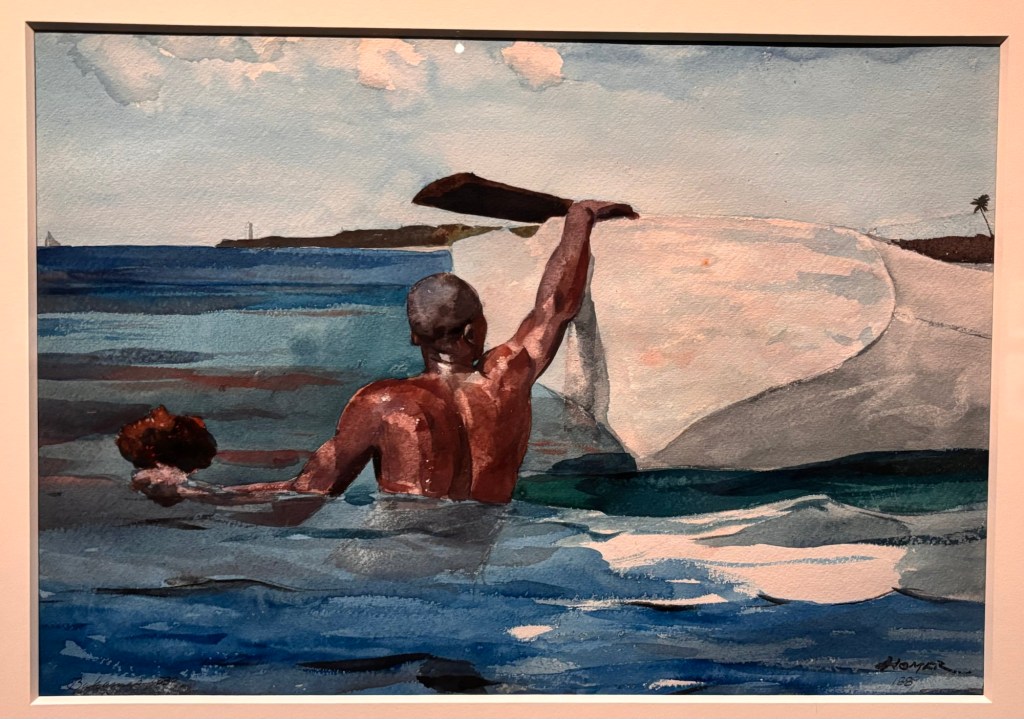
A sponge diver in the Bahamas. I have no idea how he would’ve painted something like this without a photo to refer to.
Watercolor paintings are about choices. There is no real white in watercolors. Your white is your paper, so what you choose not to paint is a critical decision.
Things can be represented with just a few brush strokes. Layers matter. Choices. What will you choose to fully depict? What will you simply allude to with a brush stroke or two?
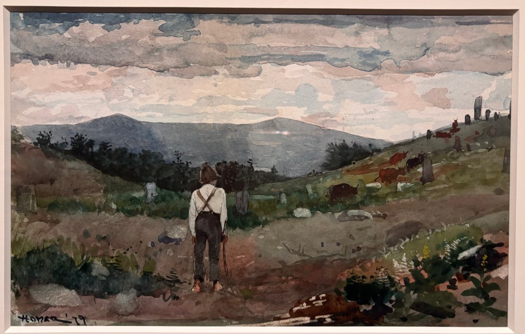
Driving Cows to Pasture, 1879 “This watercolor, painted in central Massachusetts, is noticeably looser and more abstract than earlier work. The boy, turned away from the viewer, is seemingly rooted to the ground; dappled hills and unruly vegetation surround him. A moody sky, composed of thin washes of blues and purples, casts a somber tone. The cows, rendered as brown dabs on the hillside, would be easily missed were it not for the title. Here, Homer embraced abstraction as well as some advanced watercolor techniques, removing pigment through scraping and lifting to create rough rocks and ghostly ferns.”
Everyone’s eyesight gets worse as they age. Apparently Homer told people to save rocks for your old age, because “painting rocks is easy.”
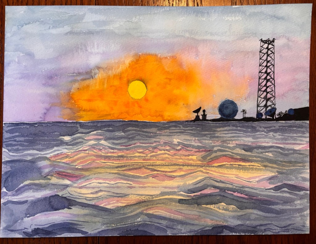
I wanted to try another one of the “resistance” methods from Monday’s class, so I blocked out the sun and the other large sphere with blue painters tape. I’m not sure why I got that dark ring around the sun. Maybe the paint collected and mixed under the tape? I painted the sky very wet. I’m going to bring this in next week for feedback/help from the class.
Here was the inspiration:
Key West sunset with the Naval Air Station on the horizon (supposedly that is truly the Southernmost Point in the US, rather than the tourist buoy).
Fond memories of Key West. Hopefully we can go back sometime 🌅
Yesterday was a discussion of the various “resisting” techniques (tape, wax crayon, etc) and a demo of how masking fluid works.
I gave it a try in this painting, inspired by my photo shoot on the rail trail the other day.
Here’s the inspo pic:
You can see I tried to use the masking fluid (aka rubber cement) to try to create those tiny rays around the sun. The teacher said to rub them out a bit with a MagicErase sponge, which is a tool that watercolorists use to soften areas and rub out paint that has already dried.
I also used the MagicErase sponge on the bike path because I felt I had “overpainted” it. One of the hard things with watercolors is knowing when to stop. It’s very easy to ruin a nice effect by doing too much.
I sat away from the major gabbers in the class and was happier (although it did not go unnoticed that I changed my seat).
![A logo for "50 Happens," [a site dedicated to Gen X women with children and grandchildren] [who embrace life's challenges with humor and resilience], [featuring a modern and uplifting design] [that embodies strength and positivity] [with an elegant and playful style] [and a harmonious blend of colors like pink, fuchsia, purple, and blue].](https://50happens.blog/wp-content/uploads/2024/12/img-5uorrxvwartomopcpuhjfjd0.png?w=300)